In een voortdurend evoluerende marketing- en communicatiesector is het een kwestie van sturen en bijsturen om relevant te blijven. “Wij kiezen hierin resoluut voor experts en expertises, voor mensen en vakmanschap. Hebben we altijd gedaan, zullen we altijd doen,” zegt CEO Tom Van den Bergh.
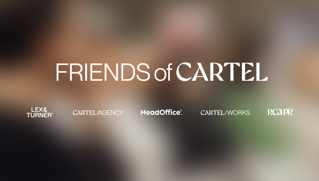
Die keuze krijgt vandaag een nieuwe naam: de agencygroep rond RCA en HeadOffice gaat voortaan door het leven als Friends of Cartel, waarbij Lex & Turner één van de vier gespecialiseerde bureaus zal zijn.
“Afscheid nemen van een sterk merk doe je niet licht. RCA had een stevige identiteit opgebouwd. Maar het momentum is er. Het samengaan met HeadOffice en de participatie van Glowi – intussen bijna een jaar geleden – hebben een nieuw hoofdstuk ingeluid. Nu zetten we de volgende stap, onder een nieuwe vlag. Of beter gezegd: onder nieuwe vlaggen,” zegt Tom.
Cartel Agency wordt het creative lead agency binnen Friends of Cartel, geflankeerd door vier gespecialiseerde bureaus. Het wordt dé broedplaats voor merken en campagnes over sectoren heen, waar expertises en services binnen de groep slim gecombineerd worden. Klanten zoals Wibra, BelOrta, Het Poetsbureau, ACM Insurance, CM en Opgroeien (met o.a. Kind en Gezin) vertrouwen op dit collectieve vakmanschap.
“Onze naamverandering toont ambitie, durf en drive. Als creative lead agency maken we werk dat raakt en knalt. Wat ons anders maakt? Een team dat scherp staat, elke dag opnieuw. En onze mindset: compound creativity – denken in tijd, multi-expertise en dialoog op basis van data. Cartel Agency zal verder groeien. Samen met haar klanten”, vult Micha Appermans, managing director Cartel Agency, aan.
Friends of Cartel: een platform voor gespecialiseerde bureaus
Met Friends of Cartel krijgen de expertcenters nu ruimte om te groeien onder hun eigen naam. Want specialisatie verdient zichtbaarheid. Een eigen merkidentiteit maakt sterker.
Naast Cartel Agency zijn dit de vier vrienden waarmee Friends of Cartel van start gaat:
- Cartel Works — employer branding en recruitmentmarketing.
- HeadOffice —contentmarketing en custom publishing.
- Lex & Turner —branding en design met karakter.
- RCA PR —corporate en lifestyle PR, influencer marketing en crisiscommunicatie.
Meer dan een naamsverandering.
Nomen est omen: een nieuwe naam is een krachtig signaal. Het markeert een nieuw hoofdstuk. Een bewuste stap vooruit. Om de bureaus te versterken. Om talent aan te trekken én ruimte te geven. Om het verschil te maken in een sector waar inhoud, creativiteit en strategie samen het verschil maken. Friends of Cartel telt zo’n 100 medewerkers en heeft kantoren in Hasselt, Leuven en Brussel.