Visit Hasselt
Visit Hasselt had evolved — or rather: devolved — its brand identity throughout the years. Up to a point where it lacked distinctiveness. A damn shame! Considering Hasselt is a cozy, vibrant city that oozes a unique character.
They needed a clear-cut direction and brand identity to go along with it. So we built the 'Smaakmaker Spraakmaker' campaign as a verbal and visual front that's representative of the city's diverse tourist offerings.
Photography campaign images
Frank Gielen
Animations
Joren Peters
Animation visual HasPas
Shtick
Website
visithasselt.be
Campaign name
A city and its culture are shaped by its inhabitants. From regular Joe to the Mayor, from its artists to its entrepreneurs. Like characters in a play. And Hasselt has a diverse cast of characters.
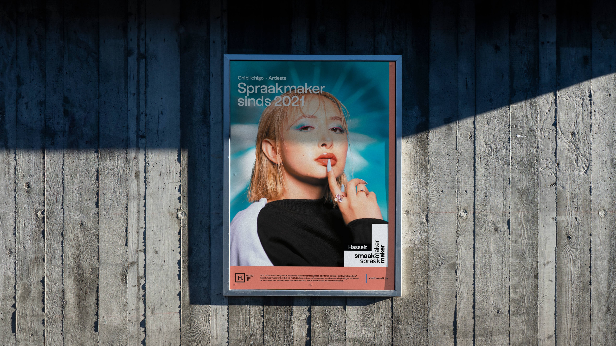
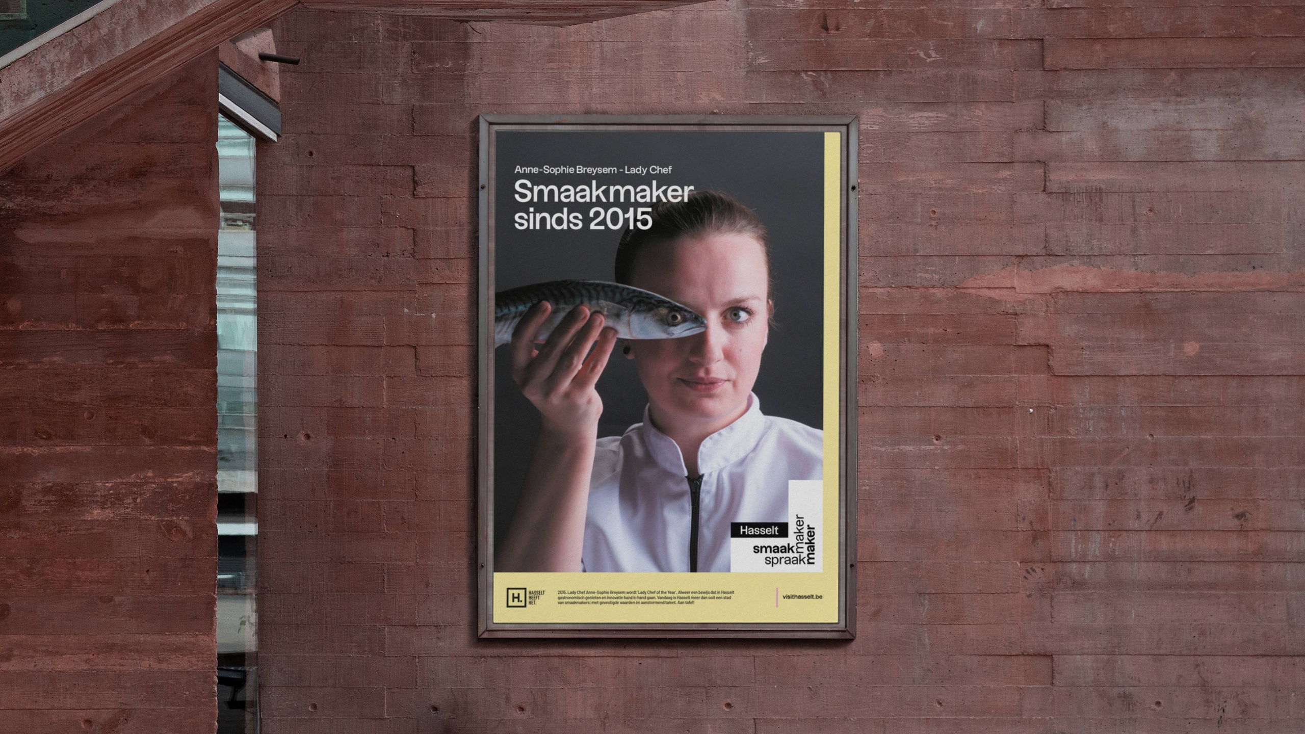
'Smaakmaker Spraakmaker' (roughly translates to 'Tastemaker, Conversation starter') elevates the city's inhabitants to prime actors in the play. It reinforces the city's sense of authenticity and the idea of being 'people-powered'.
Hasselt is also known for being 'The city of taste'. To be interpreted in any way one might like. With the new campaign name, we are taking this old passive punchline and making it active. And above all: we're sticking a face (or many faces) on it.
Logo system
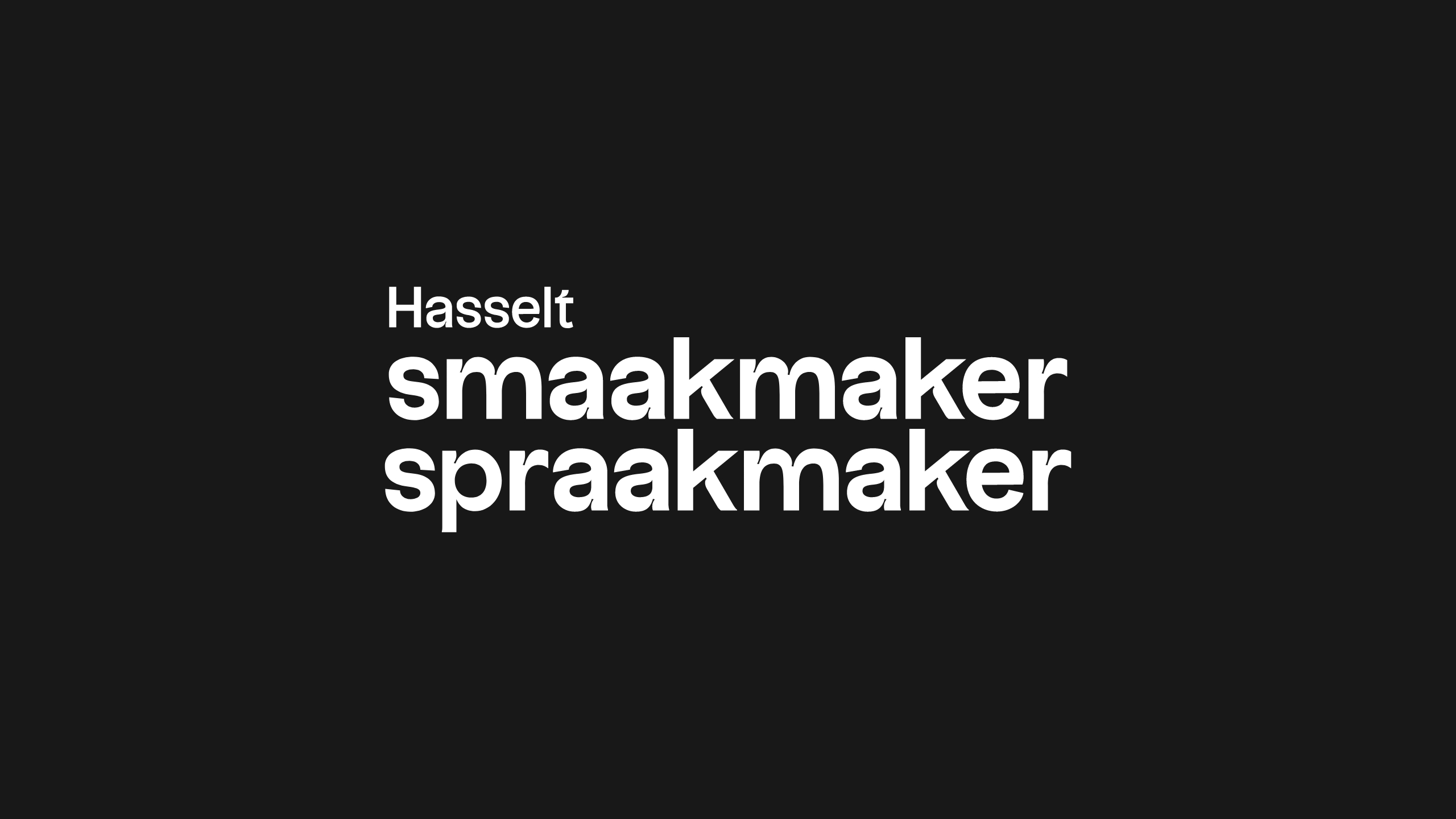
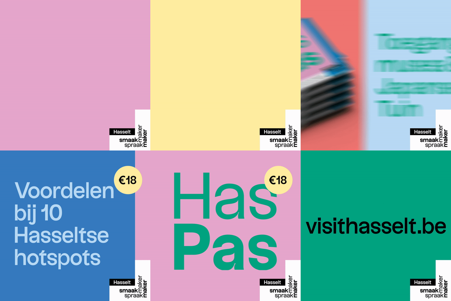
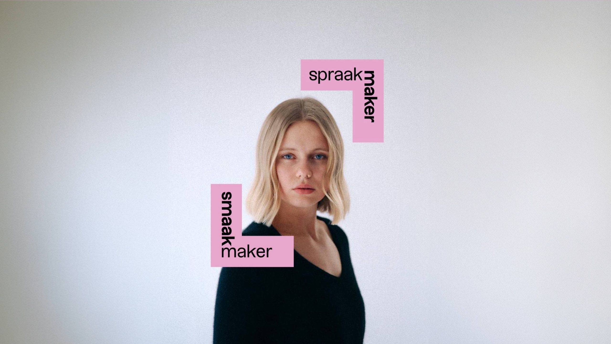
The logo takes the campaign name and incorporates it into a visual system: a frame. We’re putting a frame around Hasselt, its offerings, and most of all its people. The people inside the frame are ‘Smaakmakers, Spraakmakers’. They provide taste to Hasselt, they get people talking.
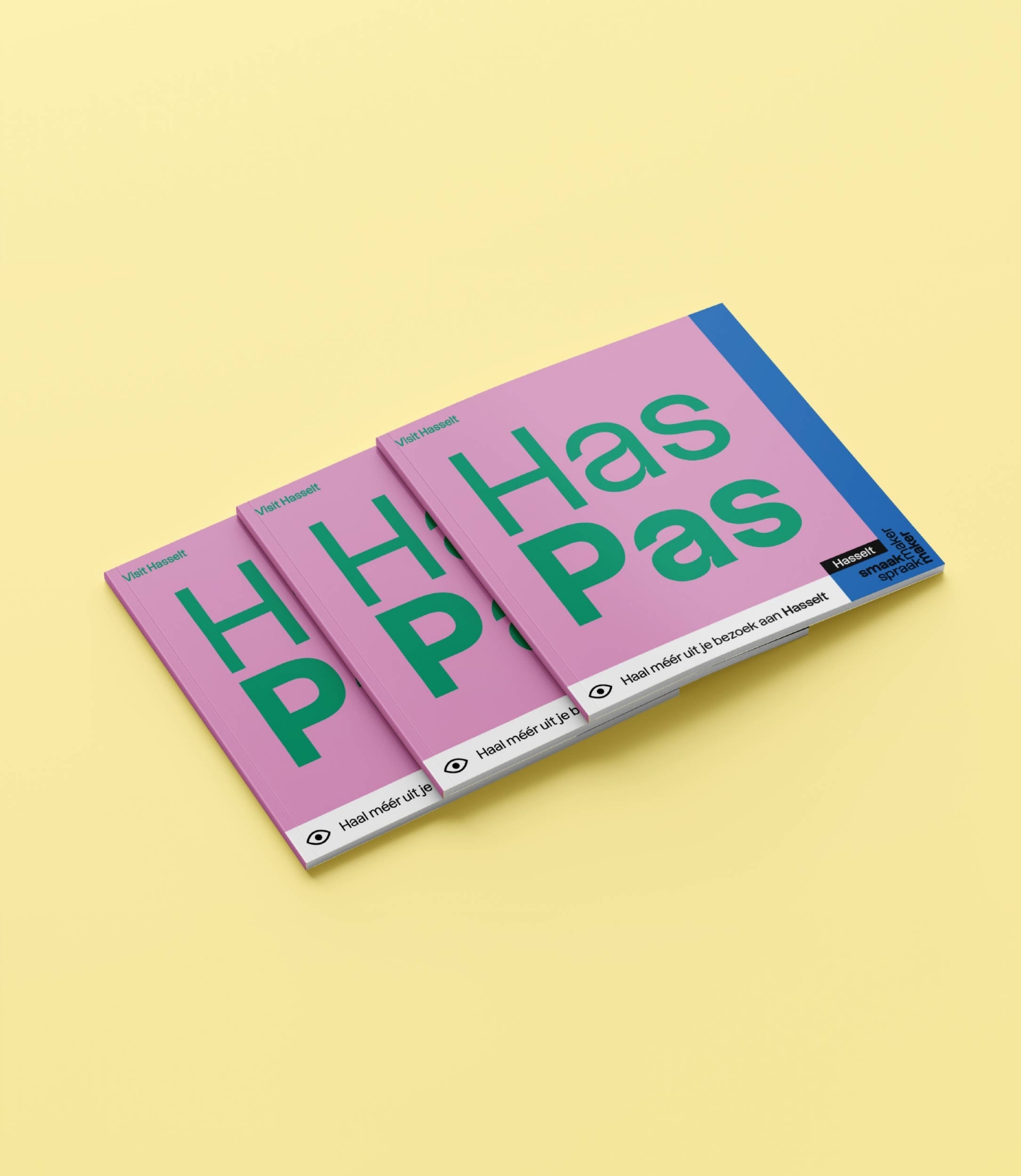
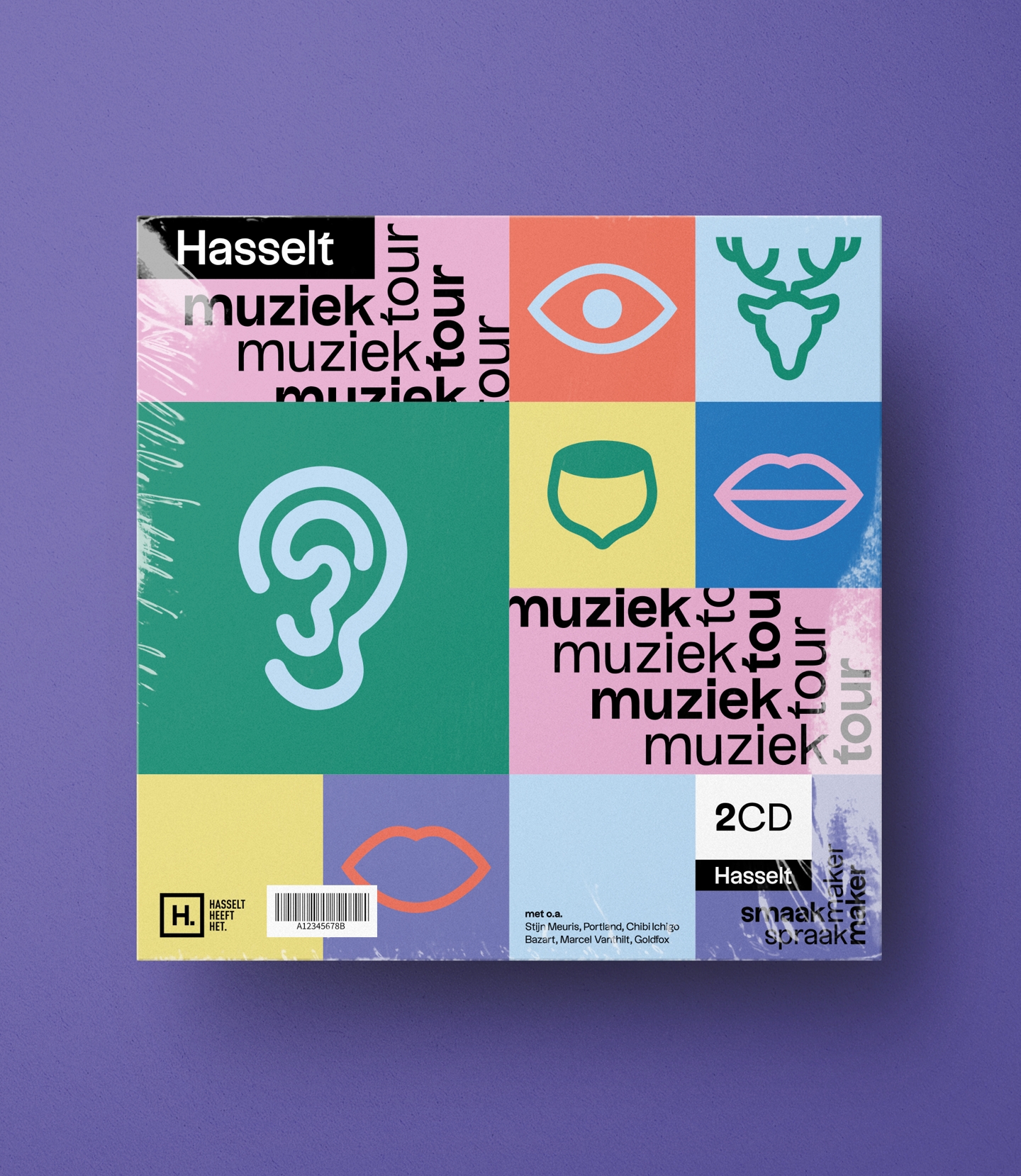
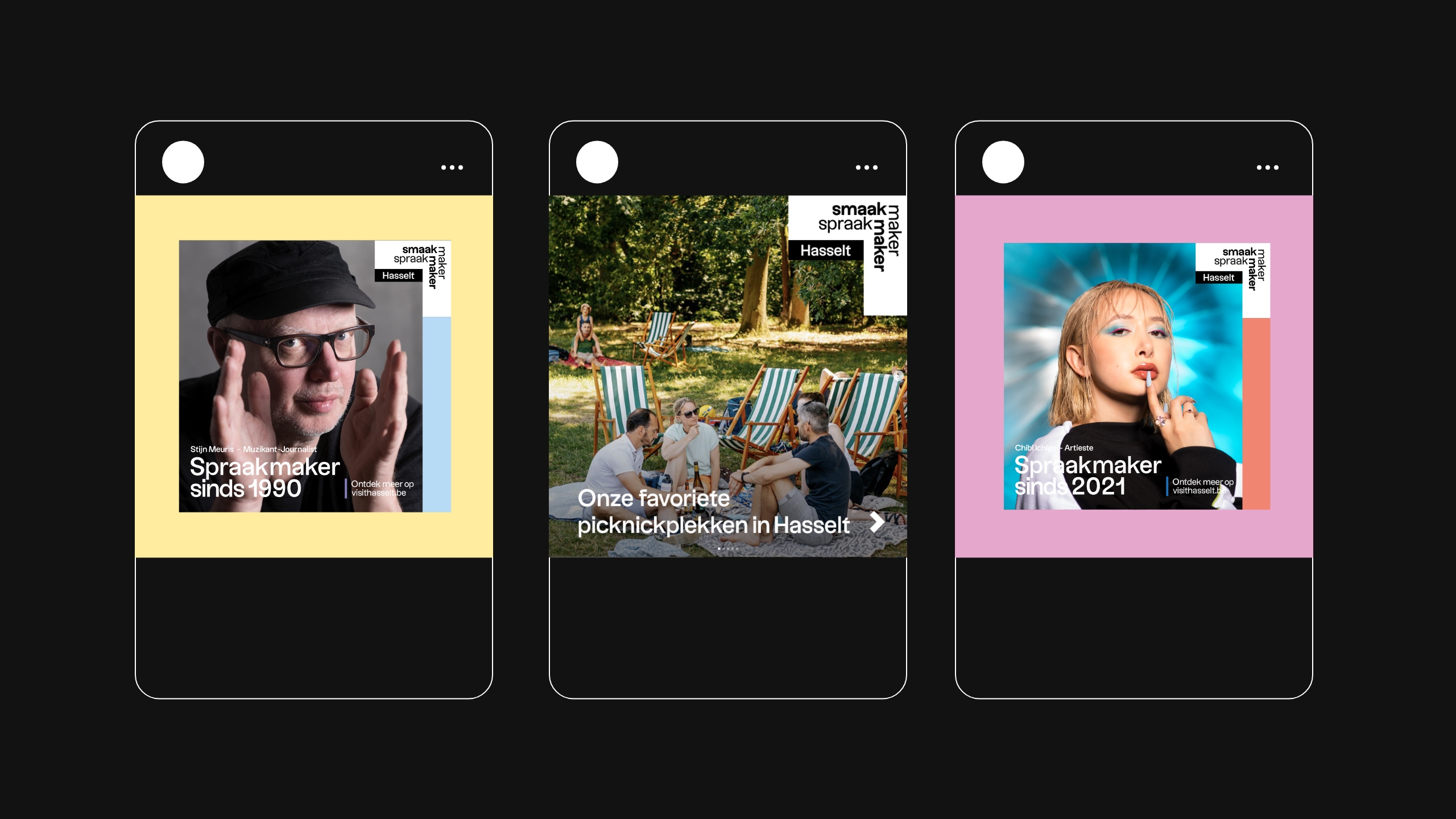
Brand artifacts
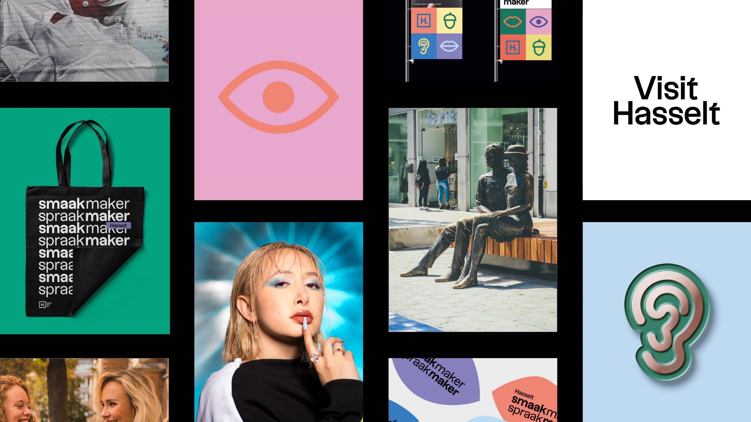
Fun and playful visual cues are either connected to the city’s history (the nut and stag) or refer to one's senses that are stimulated when visiting Hasselt: lots to see, lots to hear, lots to taste, lots to talk about.

City of colors
For being a relatively small city, Hasselt has a broad and diverse range of different tourist offerings. We settled on a diverse and vibrant color pallet that accentuates this vastness.