
Dwaalzin
A BRAND FOR THE HUMANISTIC YOUTHS OF FLANDERS & BRUSSELS
‘DeMens.nu’ (translation: ‘TheHuman.now’) is a humanistic non-profit organization that recently started a youth program.
The objective? To build a new subbrand where the youth department can thrive on its own.
Goals:
- Think of an appropriate name.
- Create an edgy visual identity.
- Develop a mobile-first website.
Sounds like a Lex & Turner kinda job
Website
dwaalzin.nu
Name
The client requested brand name that would stand out, have a ring to it, and leave people wondering. Out of several concepts, we settled on the name ‘Dwaalzin’.
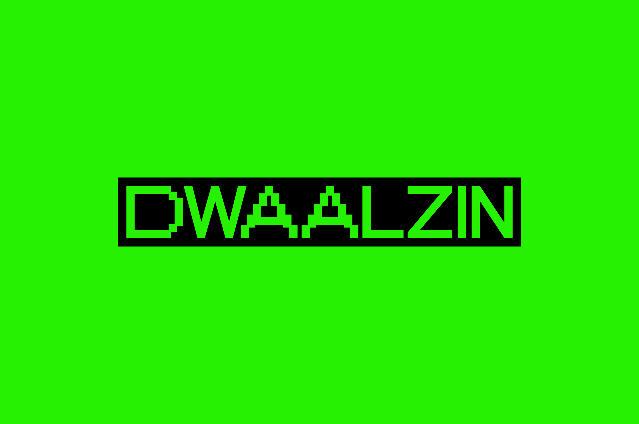
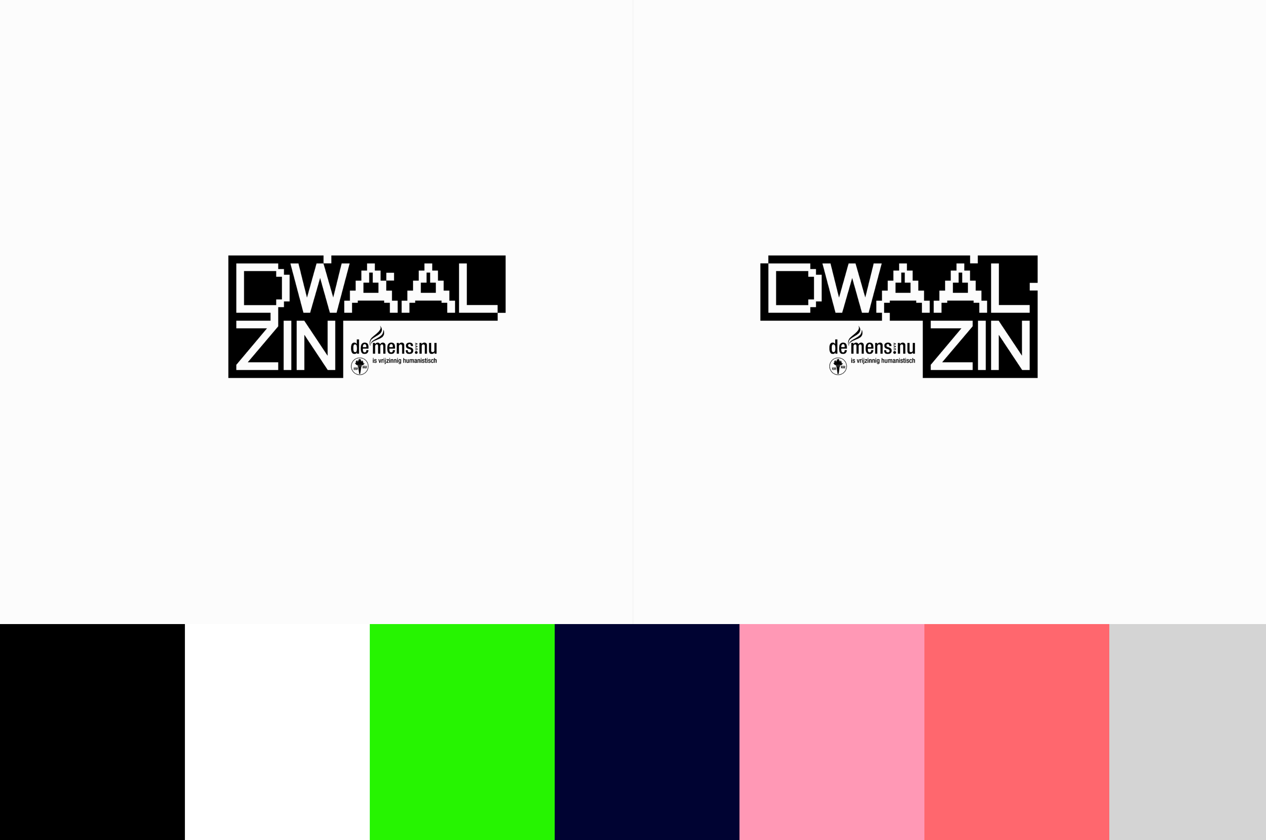
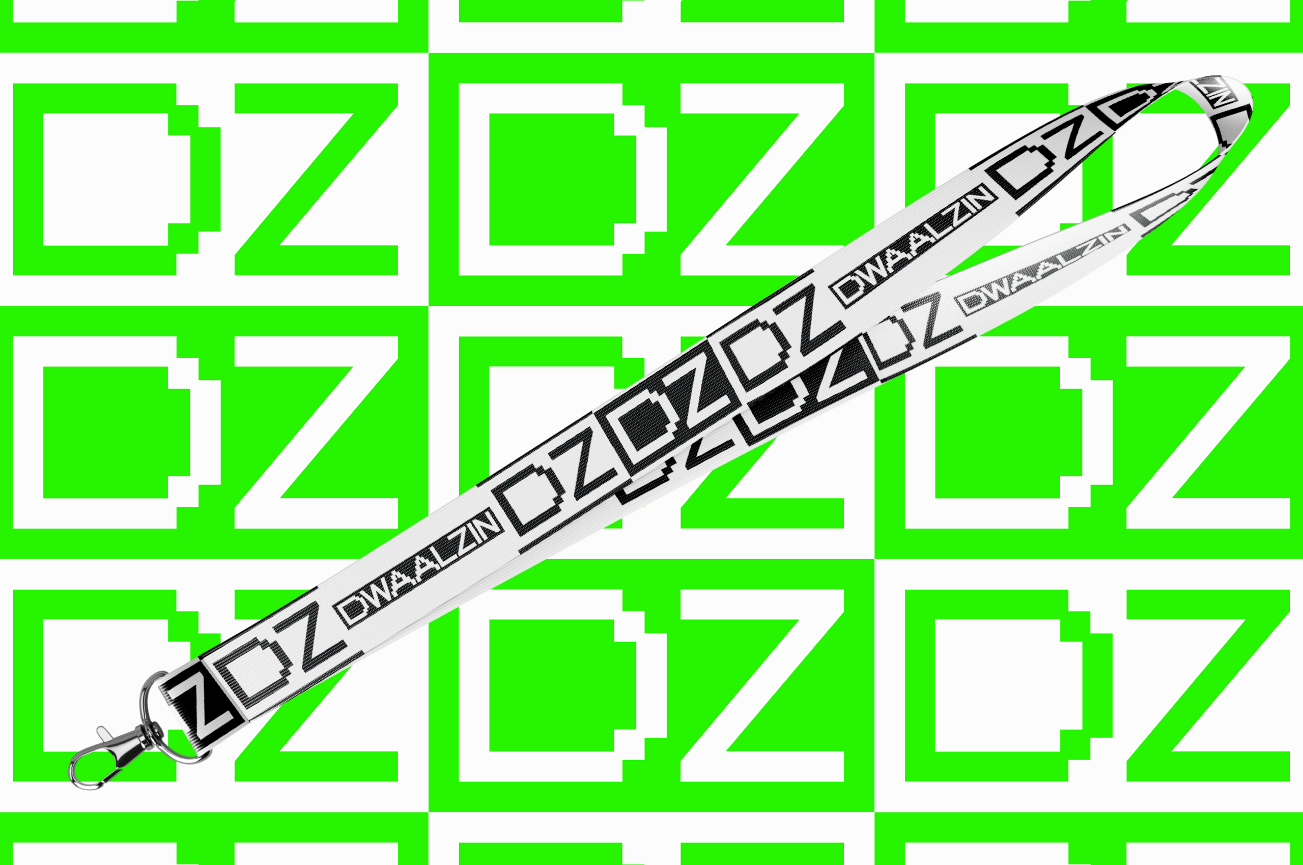
Logo wordmark
The logo incorporates the same pixelated characteristic found throughout the visual system. It emphasizes the digital environment in which a lot of youth activities occur, with a nod to more retro-digi vibes. It's 'cool,' the same way an original 1980s Gameboy is cool.
Logo: icon
The parent brand's logo contained flames, a reference to the torch, a symbol of the freethinking humanists. For the youth brand, we took that flame and shook it around, again in a pixelated style. There's subtle symbolism at play here: the youths are using the tools of the older generation, but they are rebelliously shaking things up.
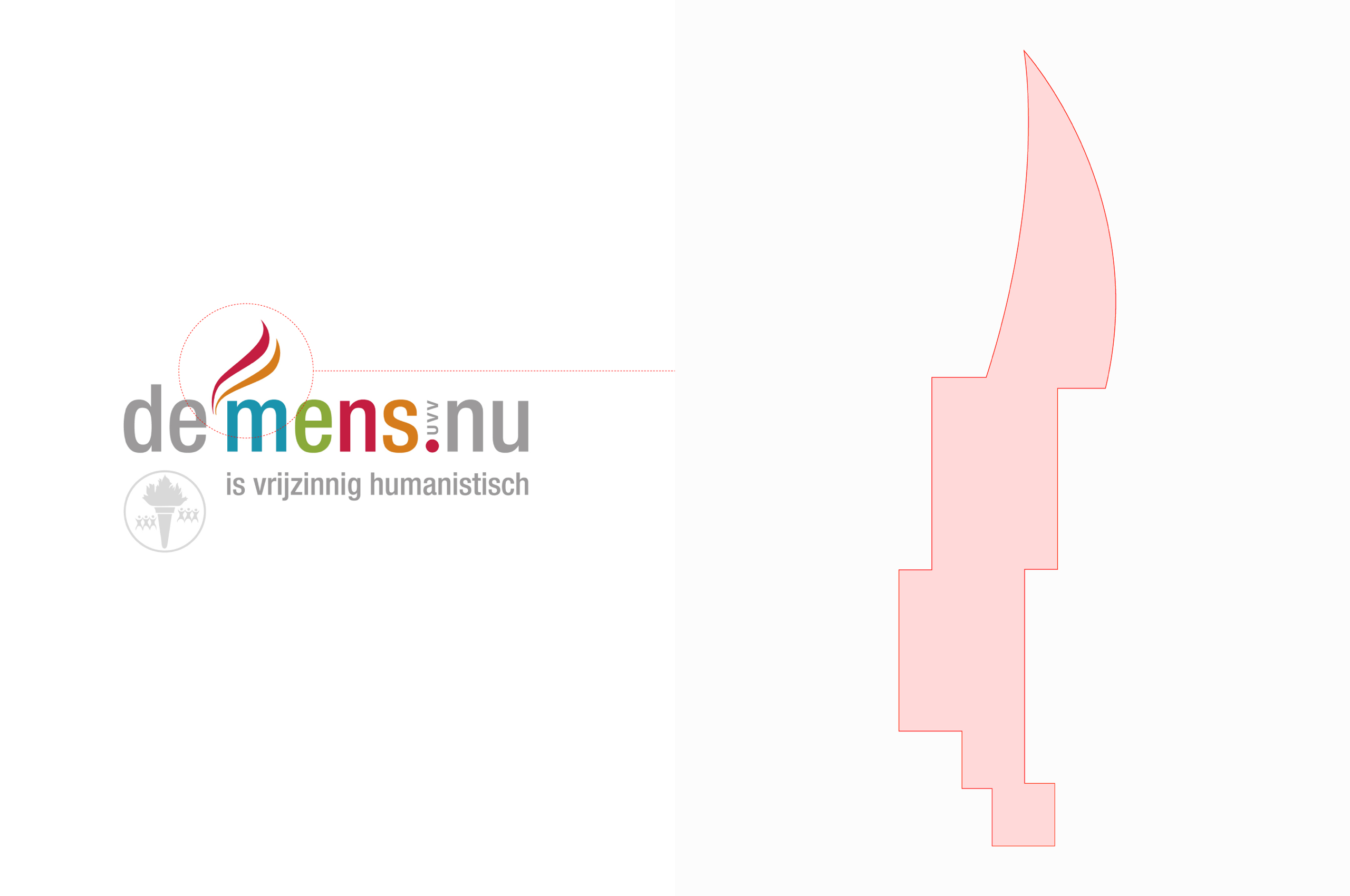
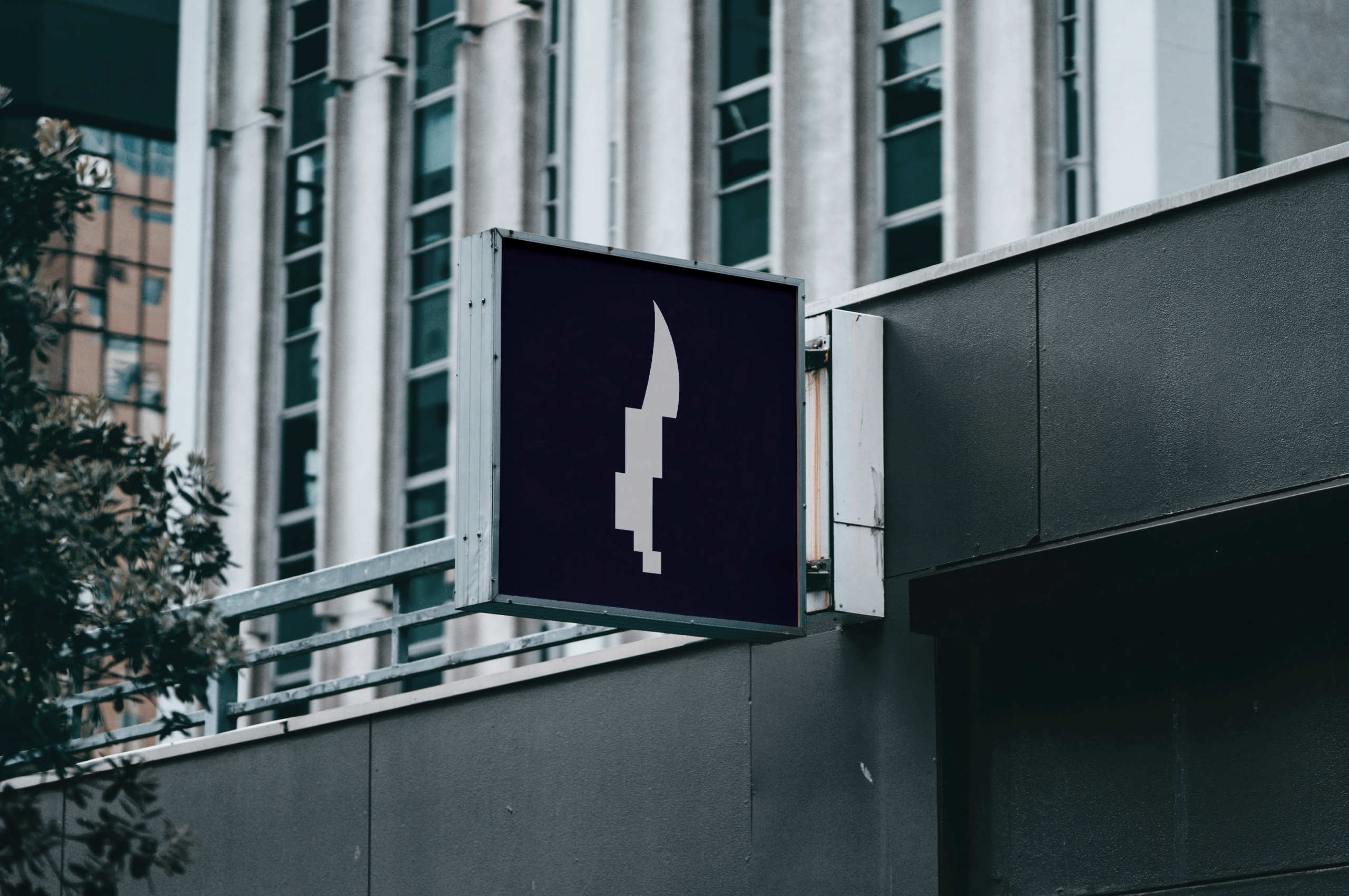
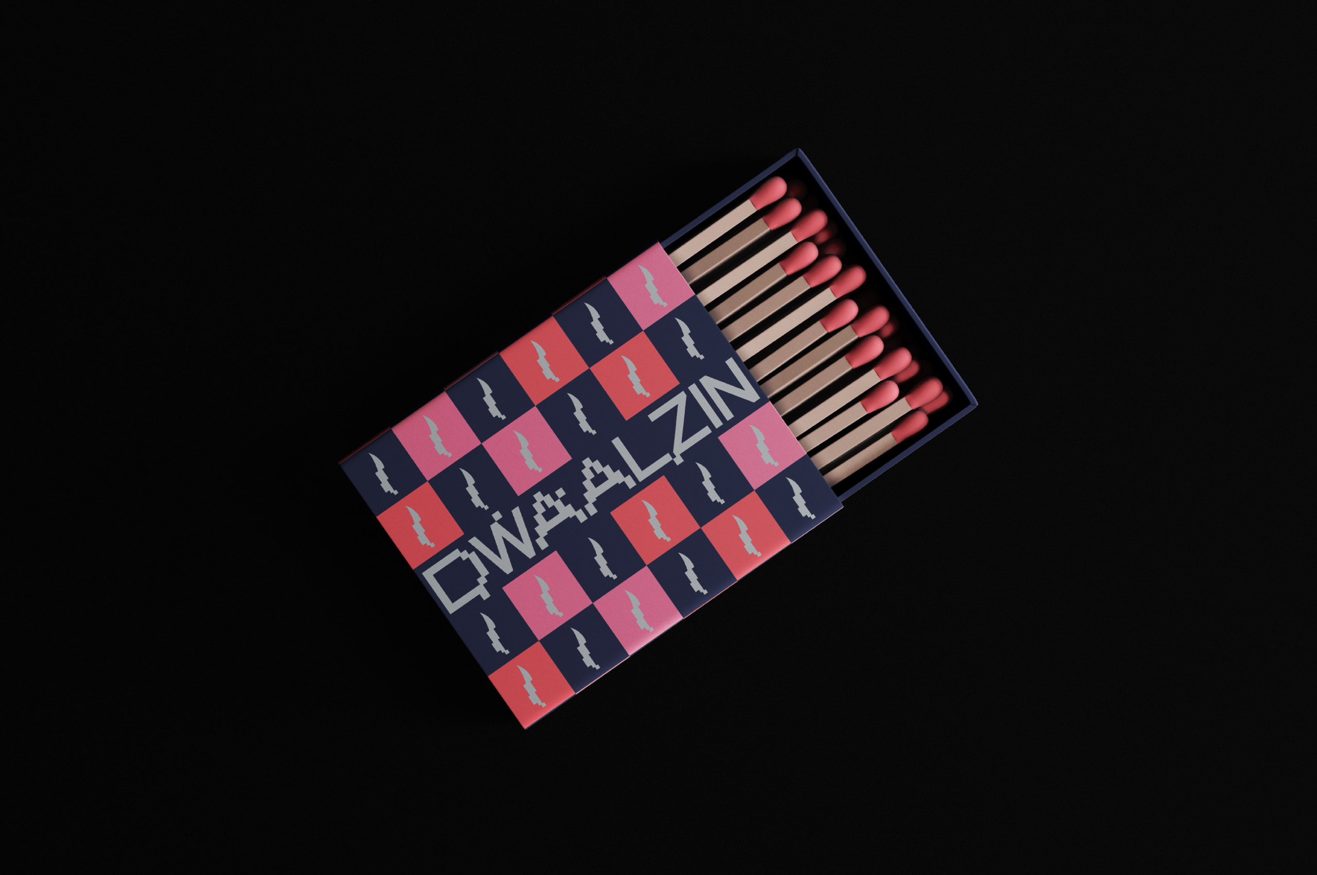
It made sense to continue along the line of the flame and incorporate the matchstick - quite literally a 'baby-torch' - that similarly connects Dwaalzin to its parent brand. As a progressive movement, the youths are the match that lights the fire of change.
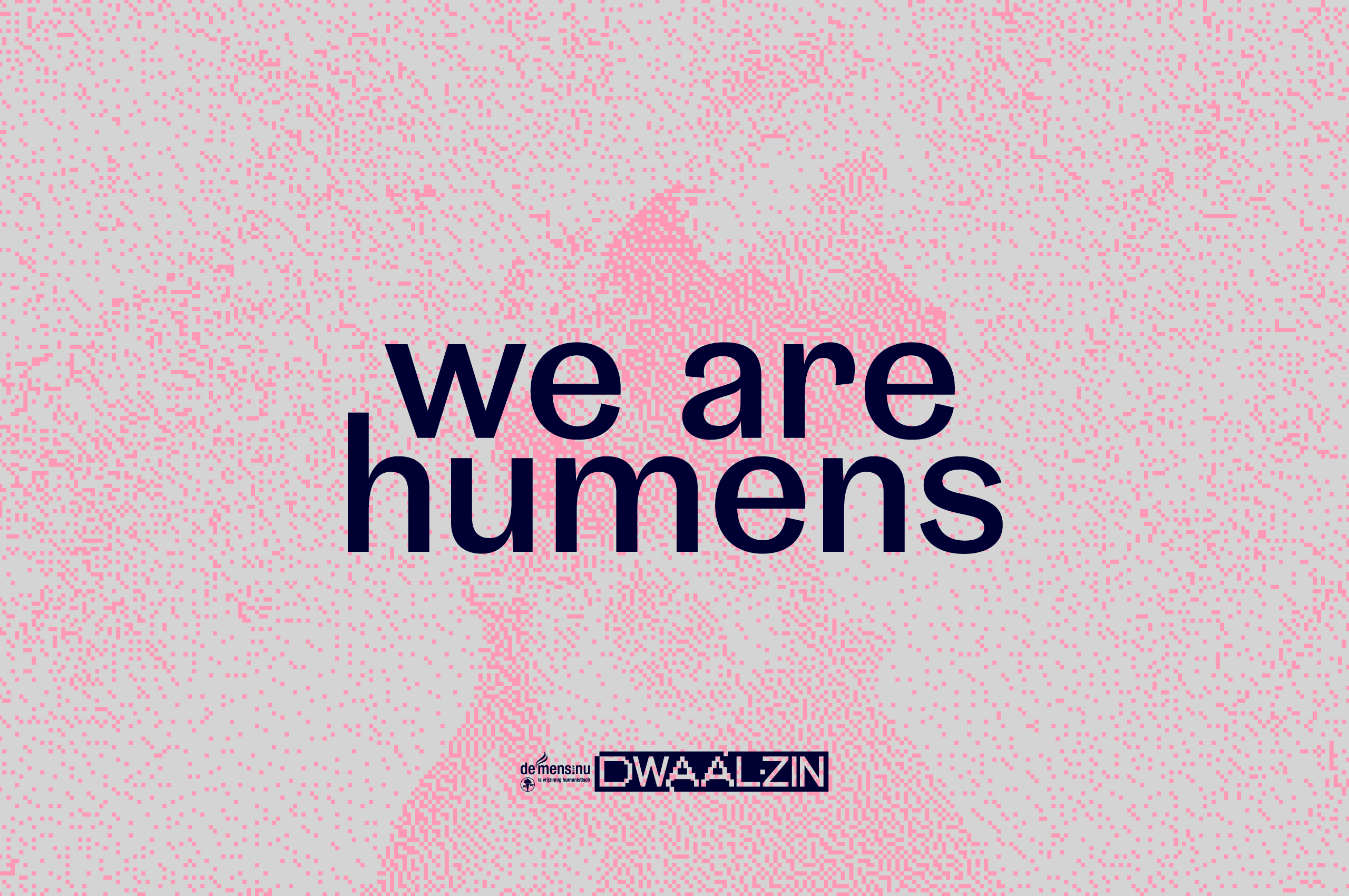
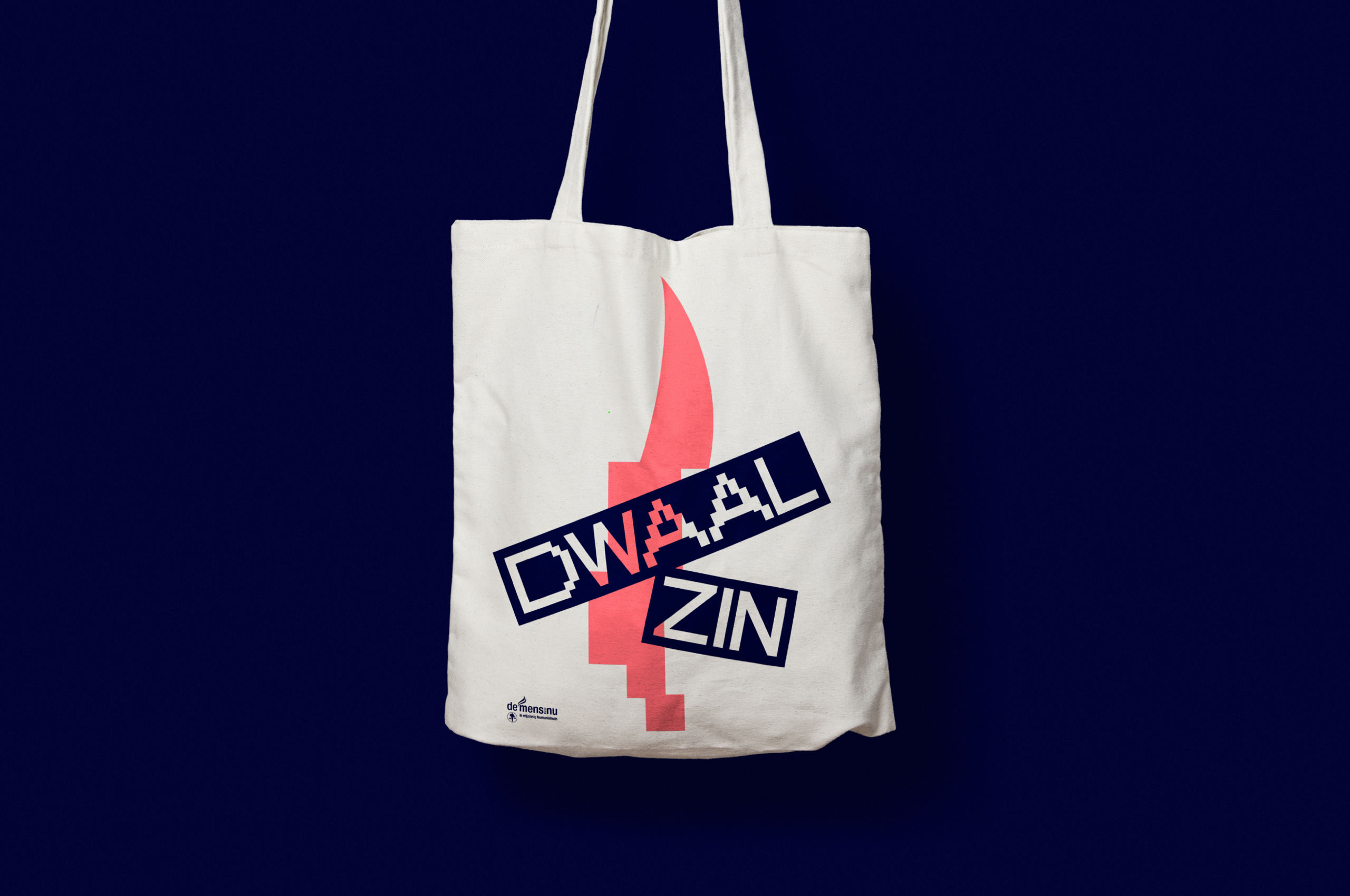
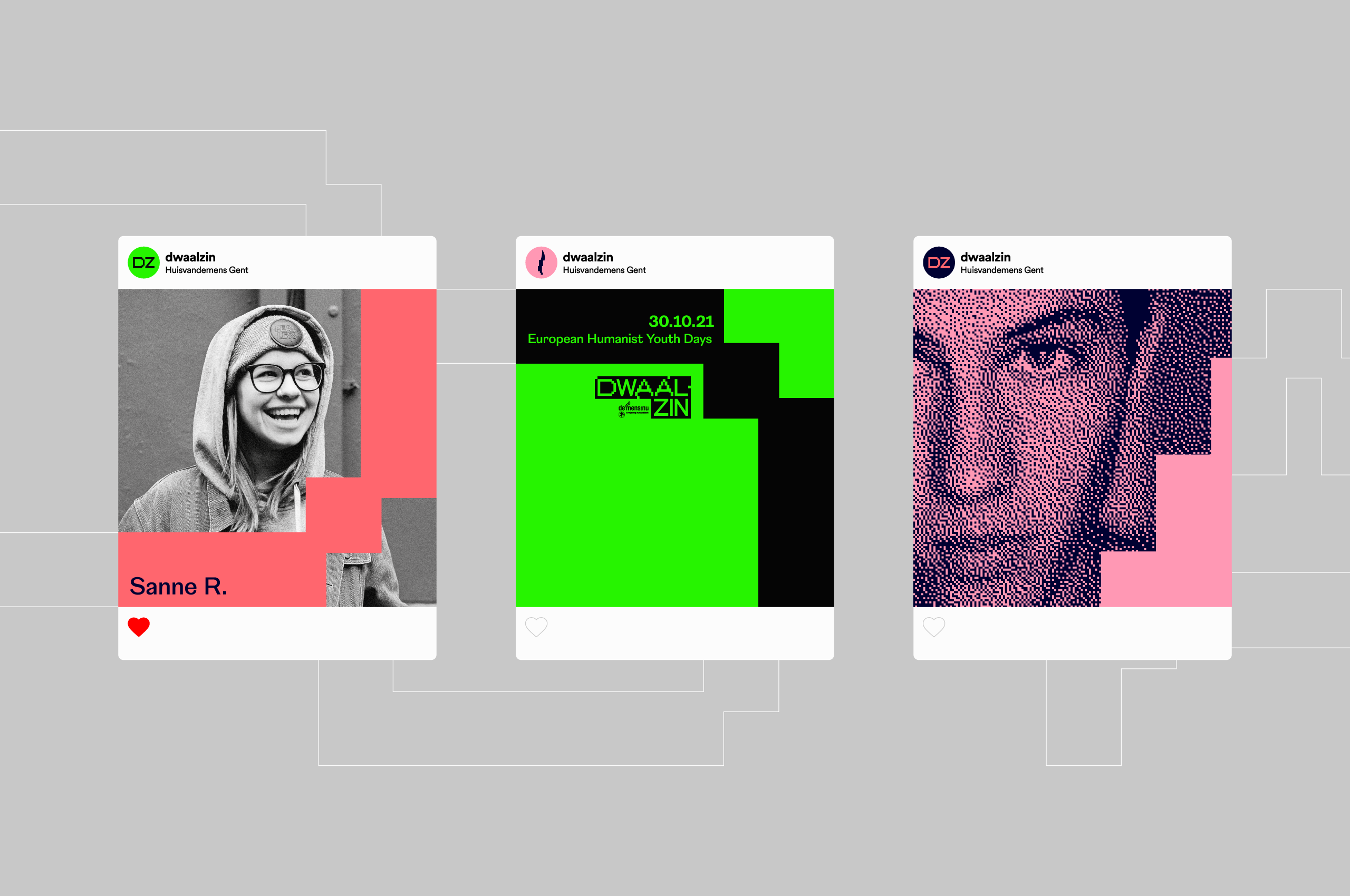
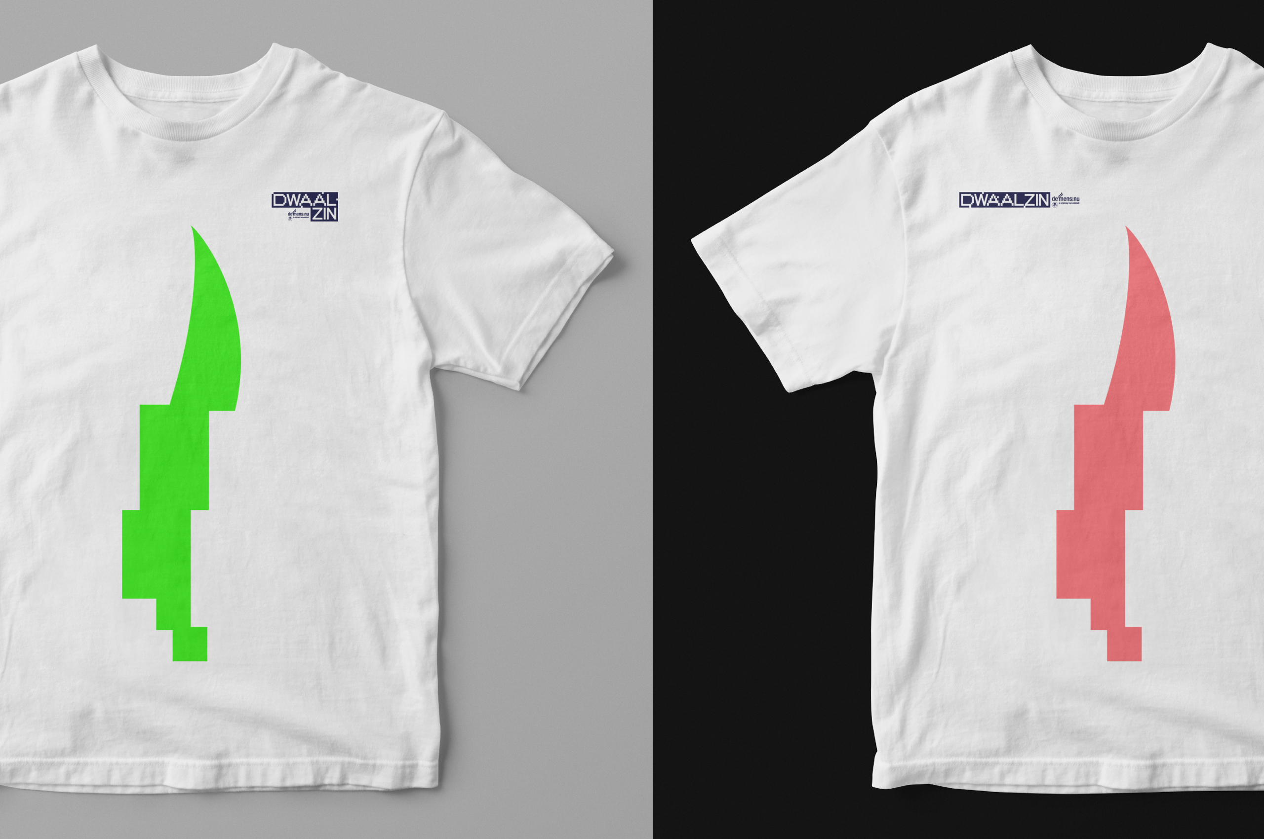
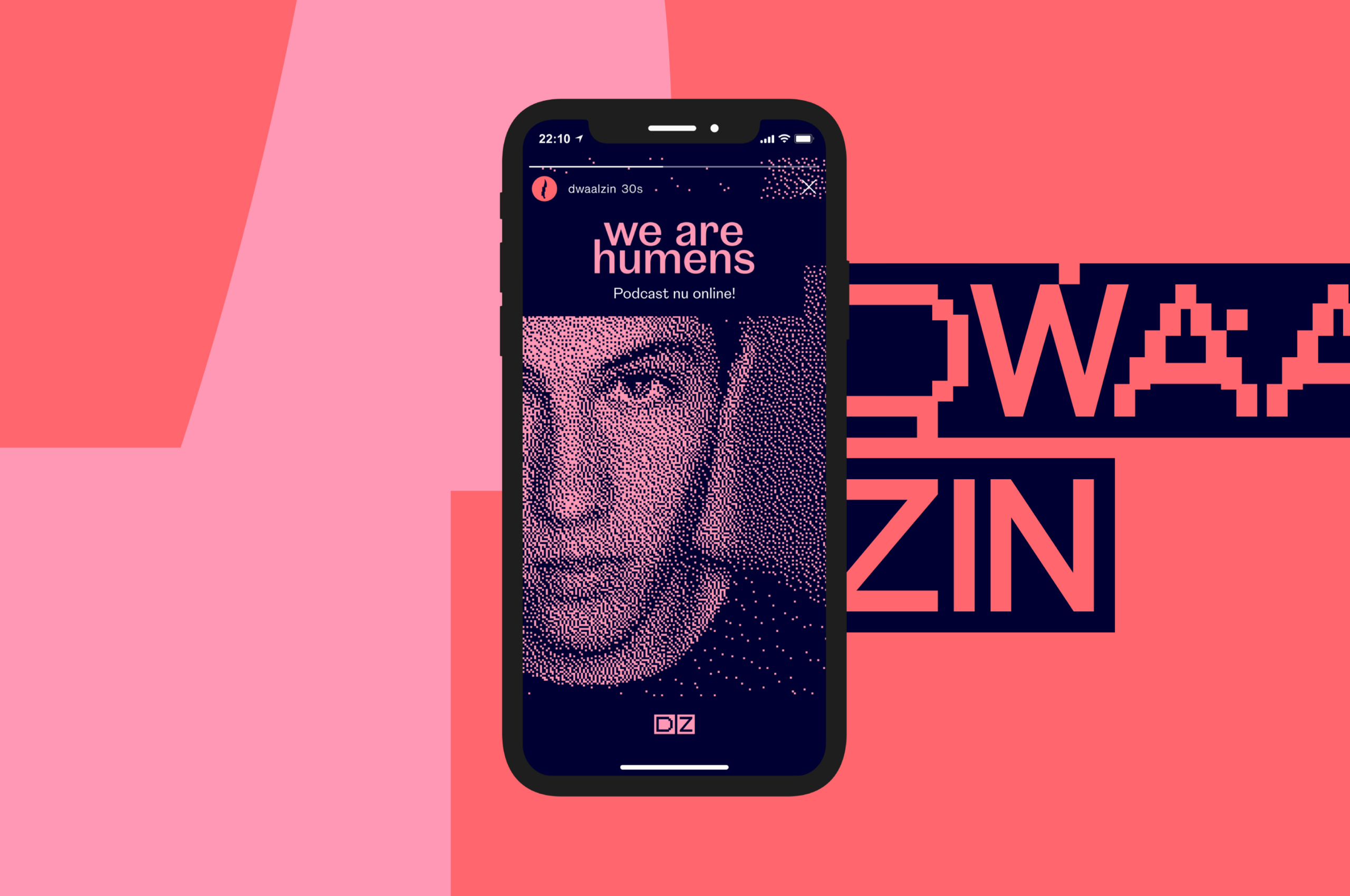
Colour palette
The client’s brief regarding colors was quite intriguing: "you can use colors as long as it doesn't look like something 'made by adults for kids’"...
Good point! And so we did. We've got bright colors that don't look poppy but rather convey a punk attitude and reinforce the youthful desire for revolution.
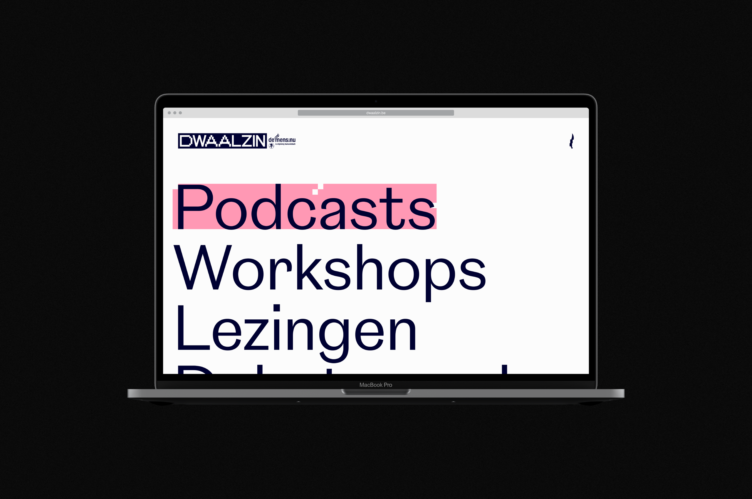
Webdesign
Dwaalzin mainly recruits its members through social platforms, so it was essential to design a mobile-first website. Whatsmore, things had to be visually intriguing, concise, and easy to navigate.
With creative naming, unique design, and effective execution, we've helped what was 'a youth program drowning in its parent brand' become 'DWAALZIN': a power to be reckoned with. Viva la revolution!