
Plooy
REBRANDING & RENAMING
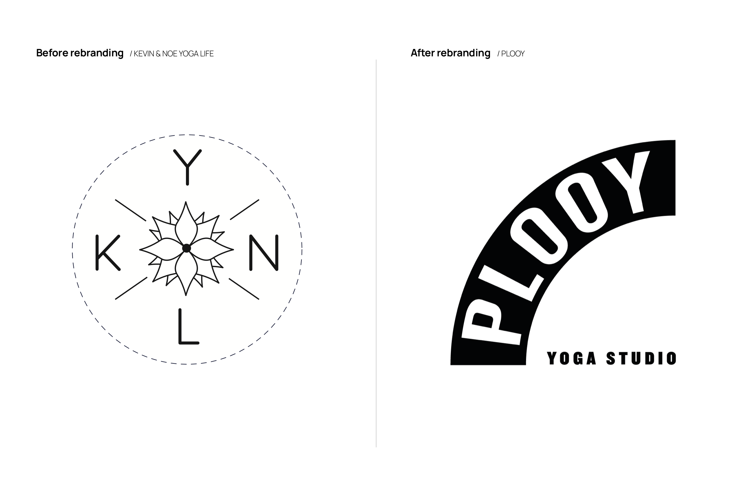
After 5 years it was time for K+N yoga to shed their skin. The result? A visual identity that’s more in tune with who they are today. In their own words: "Our new brand identity is sober — yet playful and funny. Very us." We couldn't agree more.
Website
plooy.be
Punk vs Pop
Owners Kevin & Noémie are very different from each other. And that is exactly why they are such a good match. It was a tough challenge to find the right tone of voice. Somewhere between punk and pop. Professional and playful. Creative and at the same time scientifically based. Just like the owners.

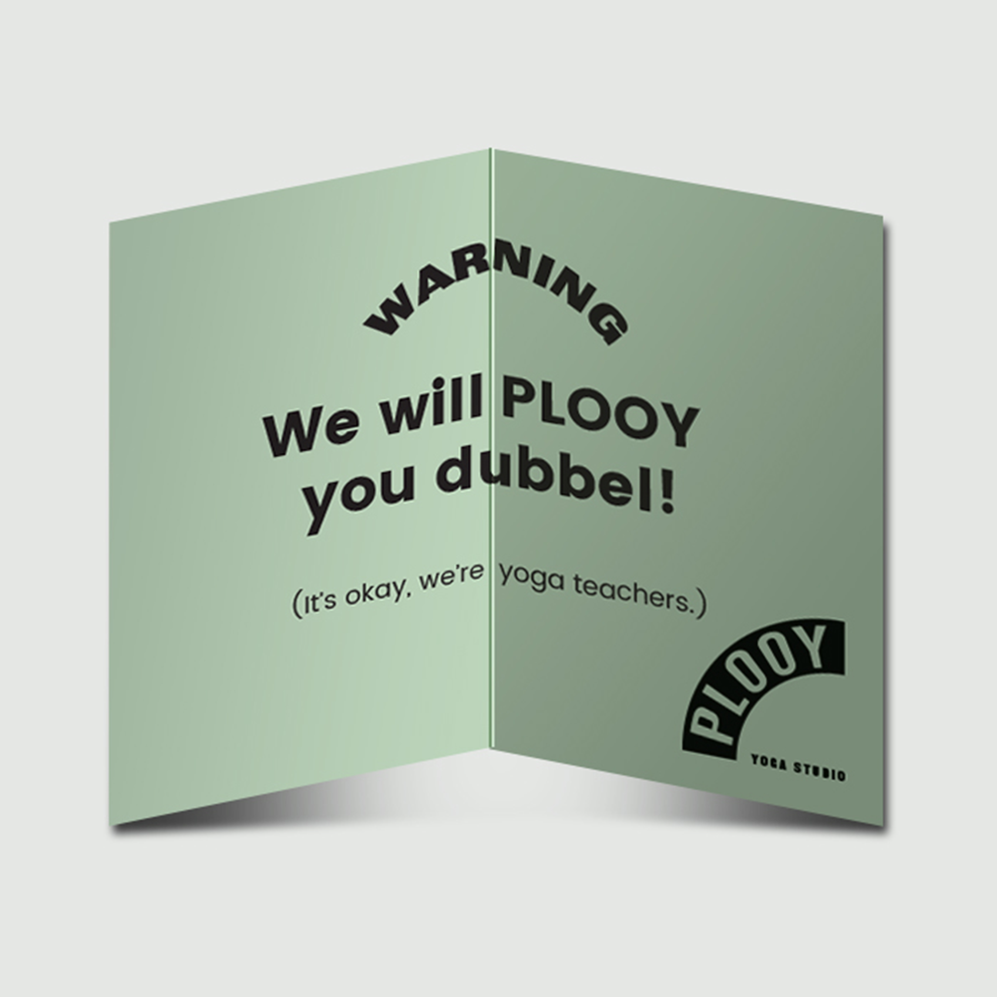
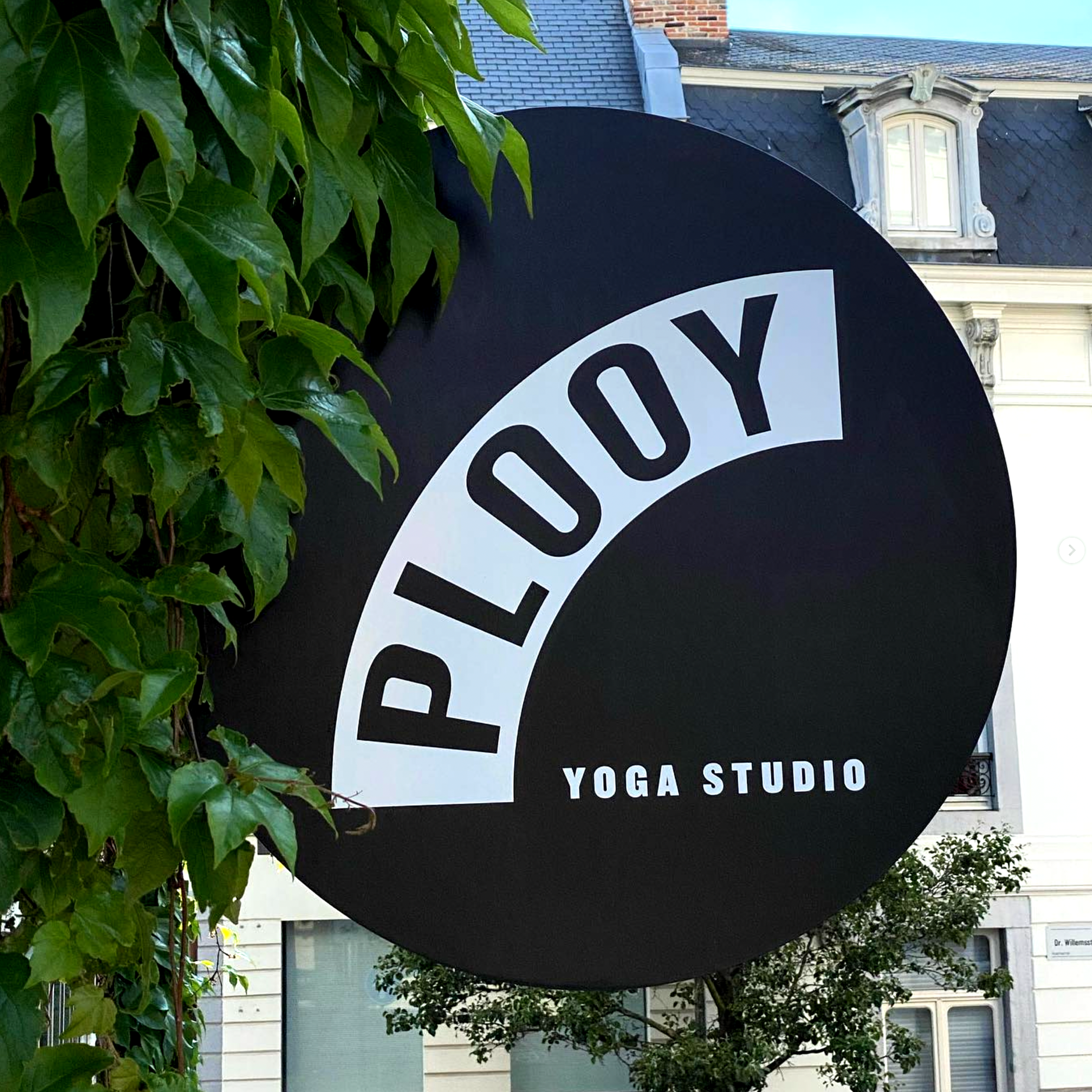
Long live Plooy!
By finding a new name (PLOOY!) - everything fell into place quickly. Plooy, which is Dutch for 'to bend', 'to stretch', 'to be flexible' ... opened up a lot of graphic and conceptual possibilities.
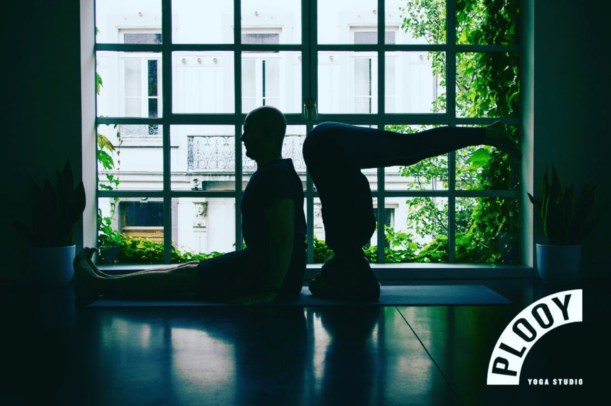
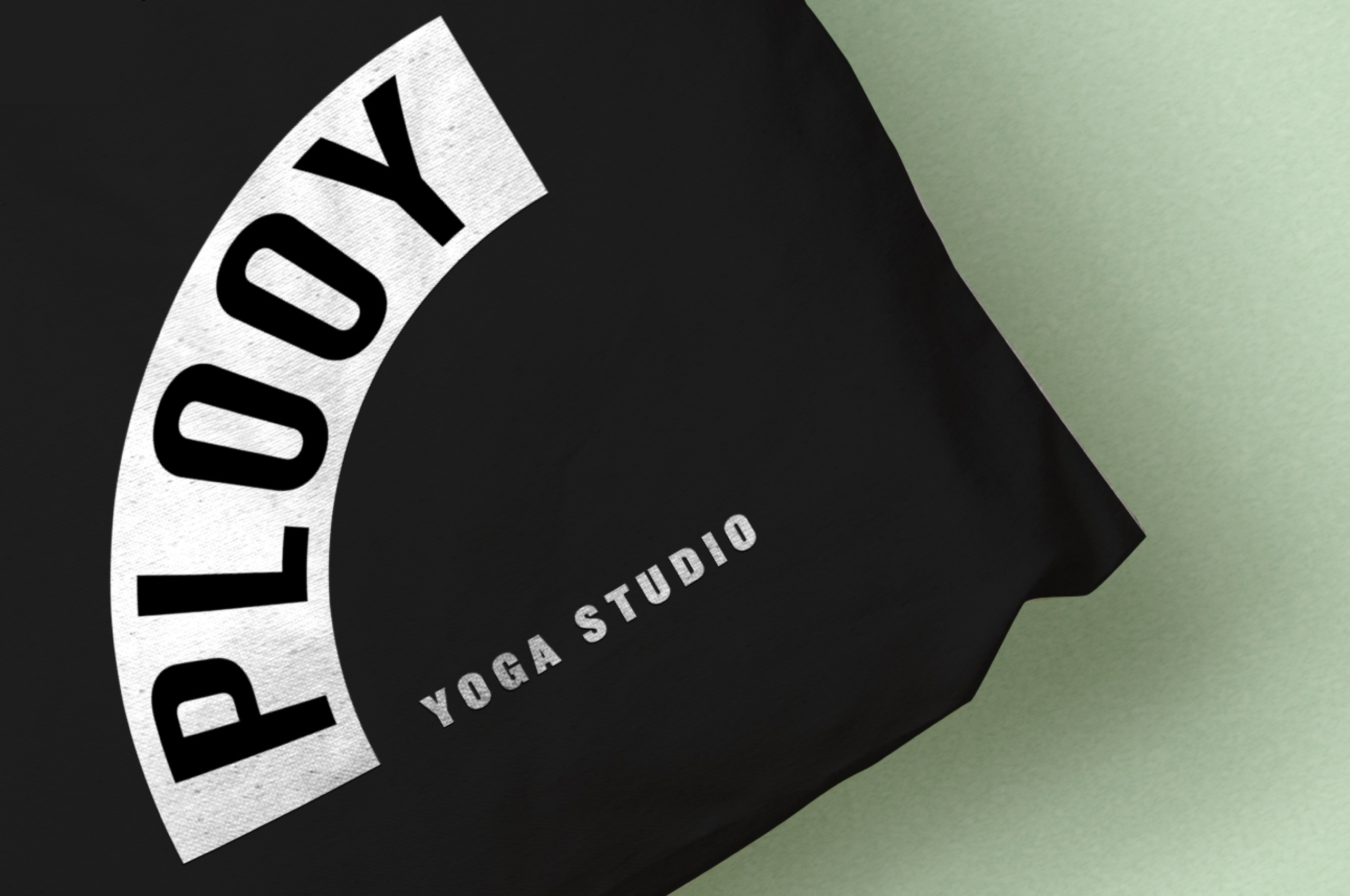
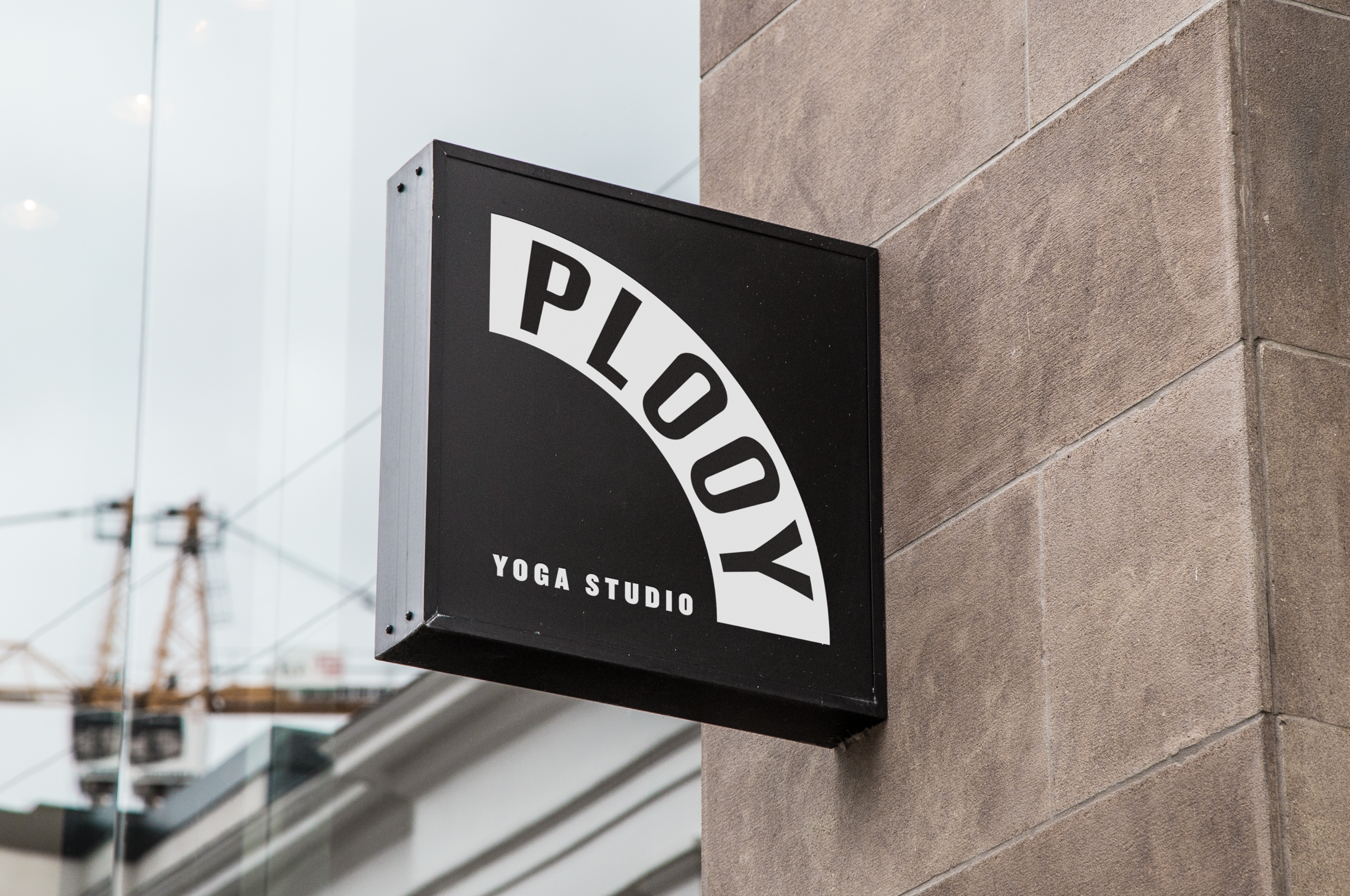
Bend — don’t break
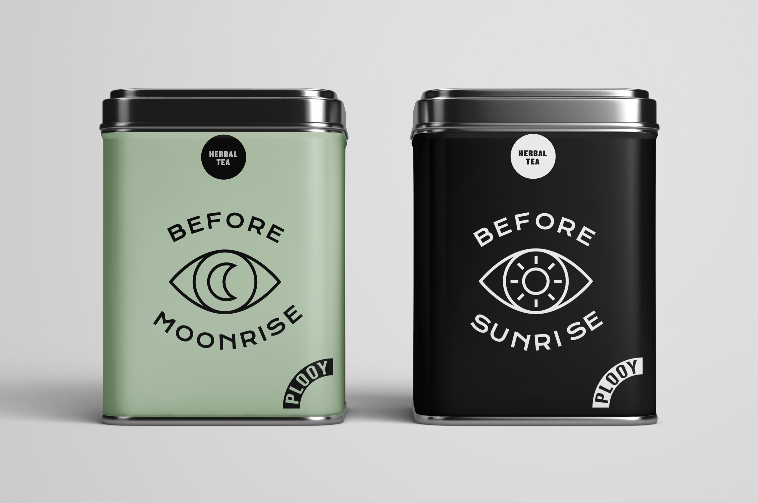
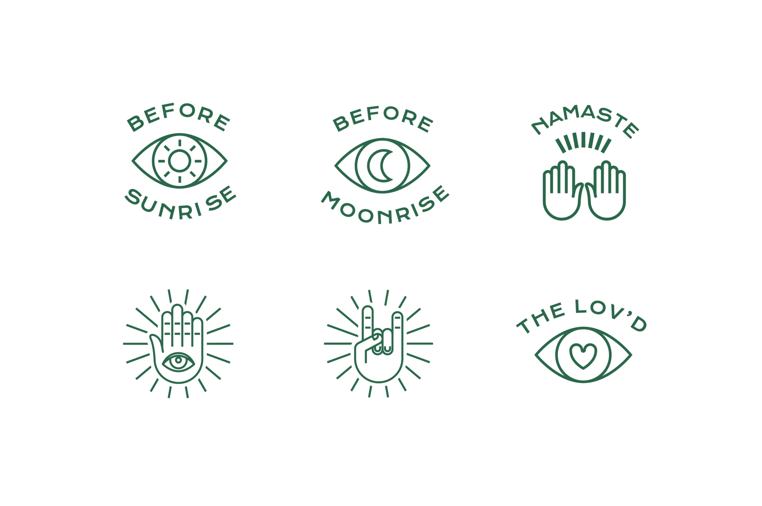
The logo can fold and bend in a thousand different ways. At the same time it is very recognizable. There’s is only one PLOOY. The color palette and the many graphic elements keep it somewhere between tough and playful.
Exit fuzzy wuzzy
Most yoga studios identities are too fuzzy wuzzy, too soft, too generic. PLOOY wanted their yoga studio to stand out. And that's what they got. Their location were already breathtaking. With this new brand identity PLOOY is ready to unfold the future.