Woodz
THE GREEN BOUTIQUE EXPERIENCE
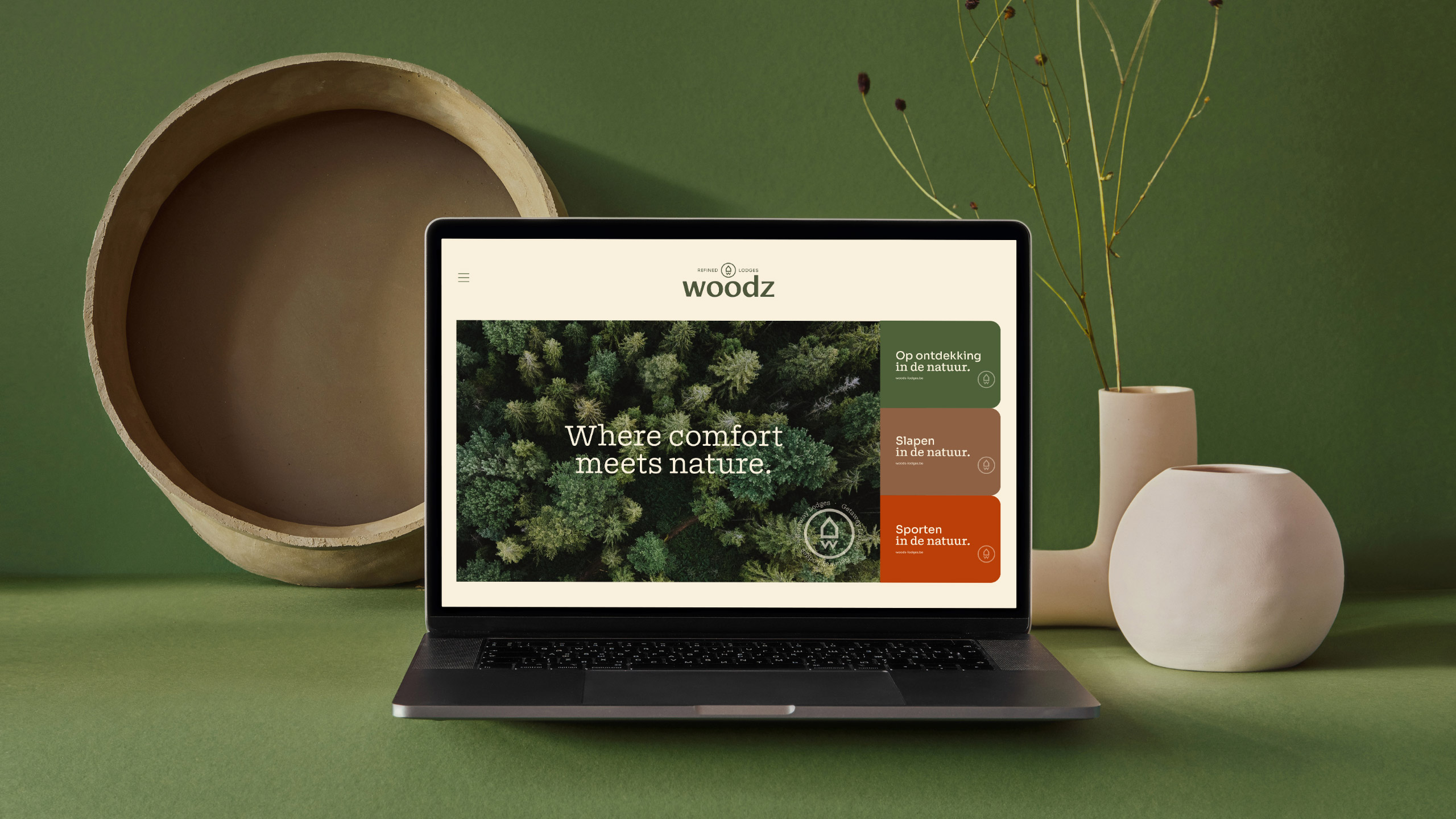
WOODZ promises the boutique experience: a premium vacation park in an oasis of tranquility and greenery - including Limburg hospitality. Our promise? An appropriate brand identity to make the whole picture come together. Knock Knock!

Website
woodz-lodges.be
Instagram
@woodz_lodges
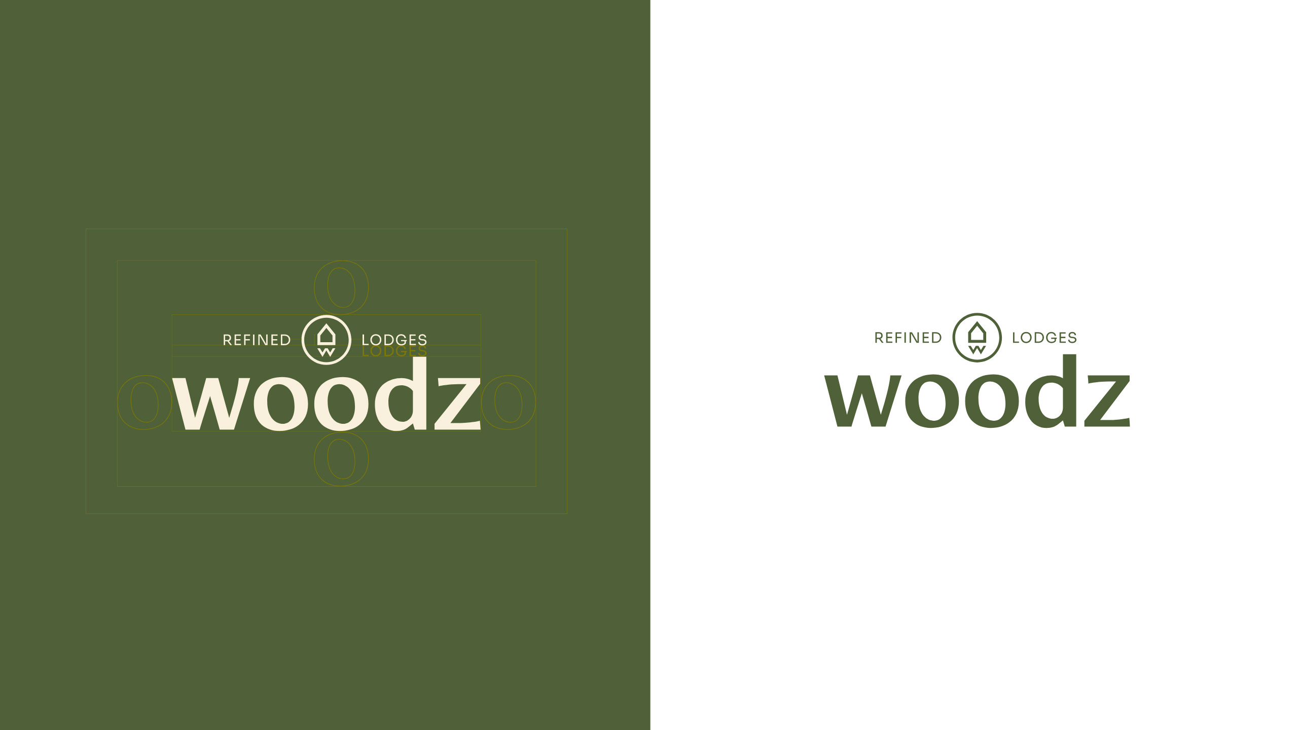
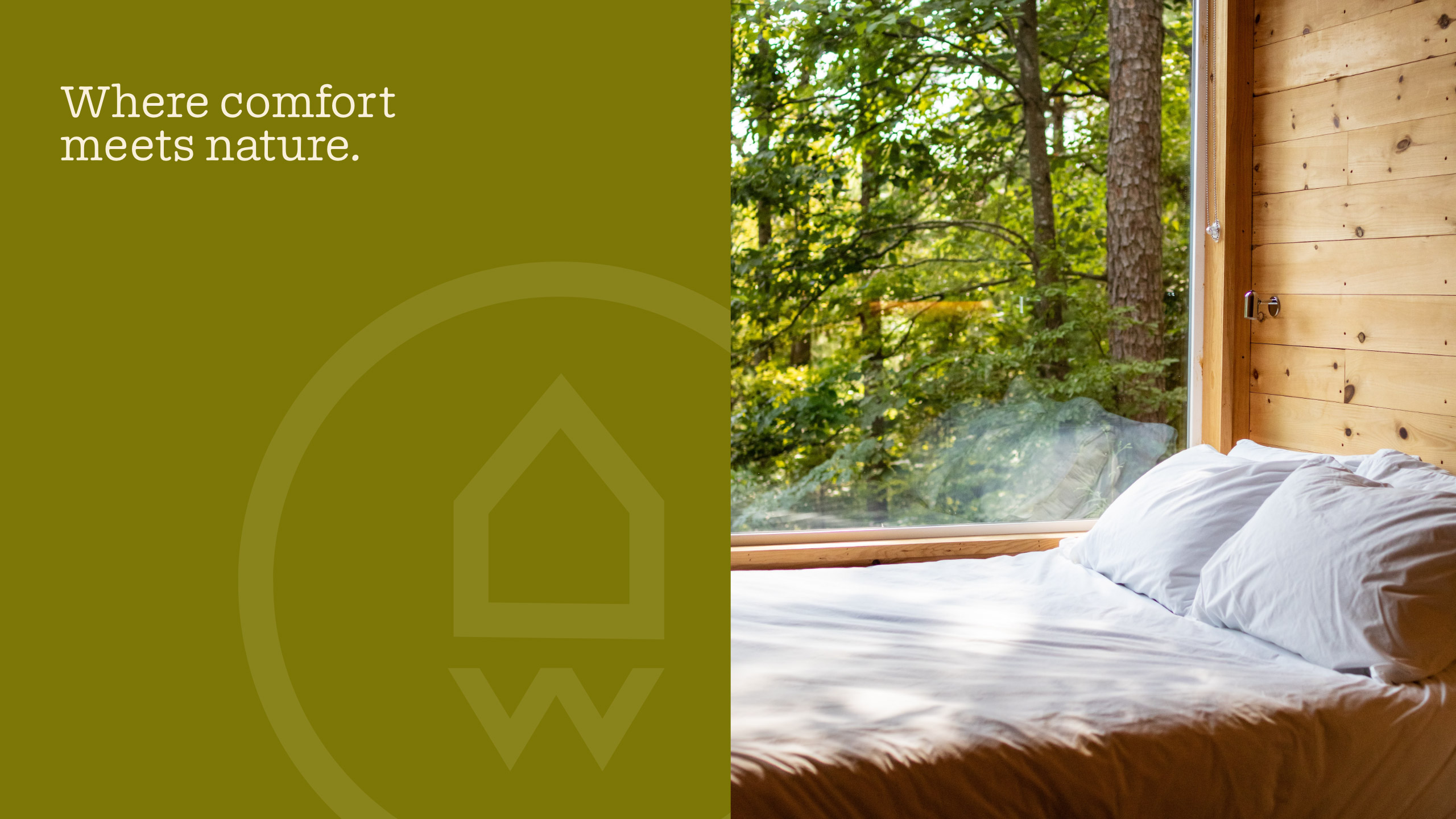
The Woodz logo is a search for balance. Between sophisticated and adventurous, between quality and conviviality. The font exudes a sleek yet casual style, evoking the warmth and texture of wood.
At the center of the logo is a visual emblem in the shape of a circle. Here, a stylized "lodge" meets the letter "W. This 'W' not only stands for Woodz, but also symbolizes the decking paths that wind through the landscape.
Harmony in color
The dominant color in the palette is green, which symbolizes the lush nature of WOODZ. Different shades of green - from deep forest green to bright grass green - represent the diverse landscapes and flora at the resort.
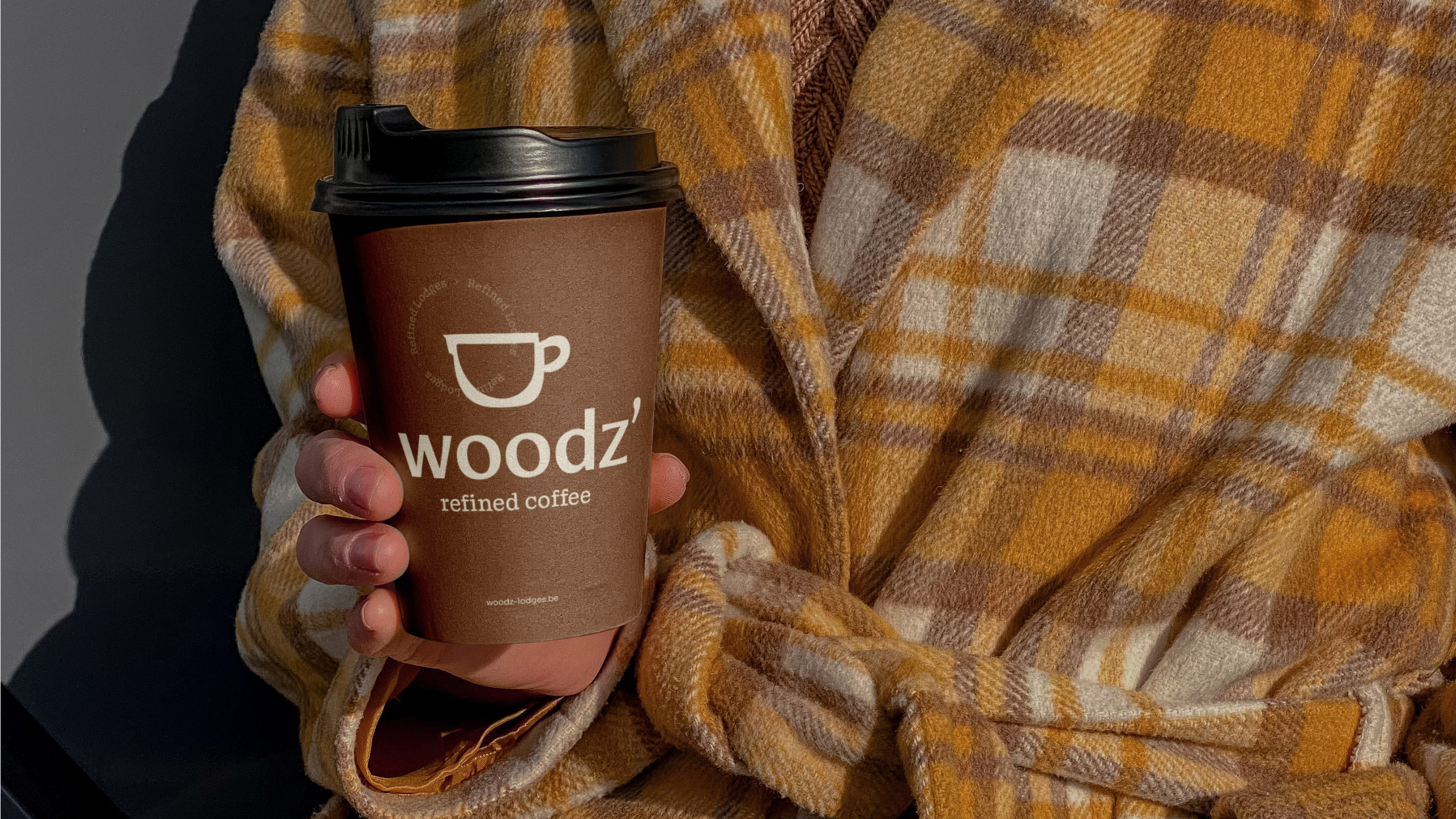
Earth tones such as brown create a sense of warmth and comfort. These colors emphasize the relaxed atmosphere. Vibrant, energetic orange emphasizes the sports activities offered at the park.
WOODZ's color palette is designed to fit together beautifully, with greens, earth tones and orange complementing each other. This creates a harmonious whole.
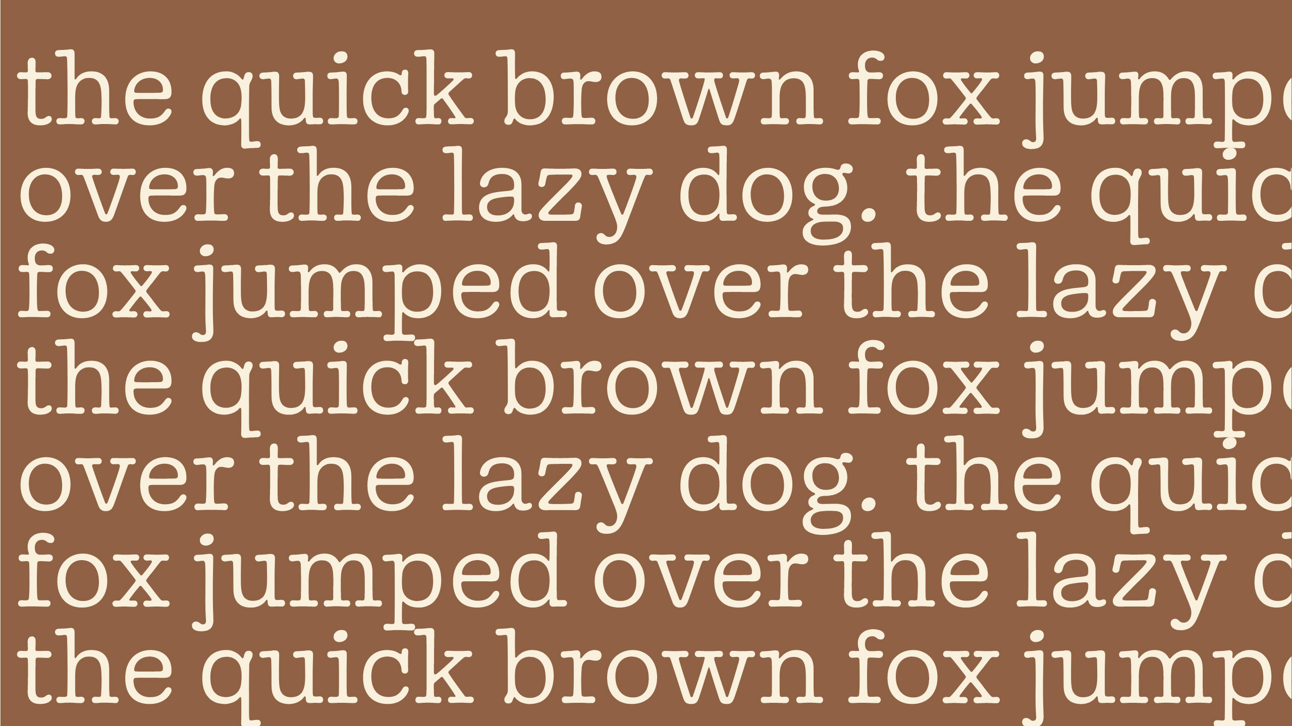
The typography also gives individuality to WOODZ's brand identity. For the body copy, we use the Sora font for a modern and readable look. The titles are given a distinctive style by the Doyle font. The combination of these two fonts creates a balanced typography.
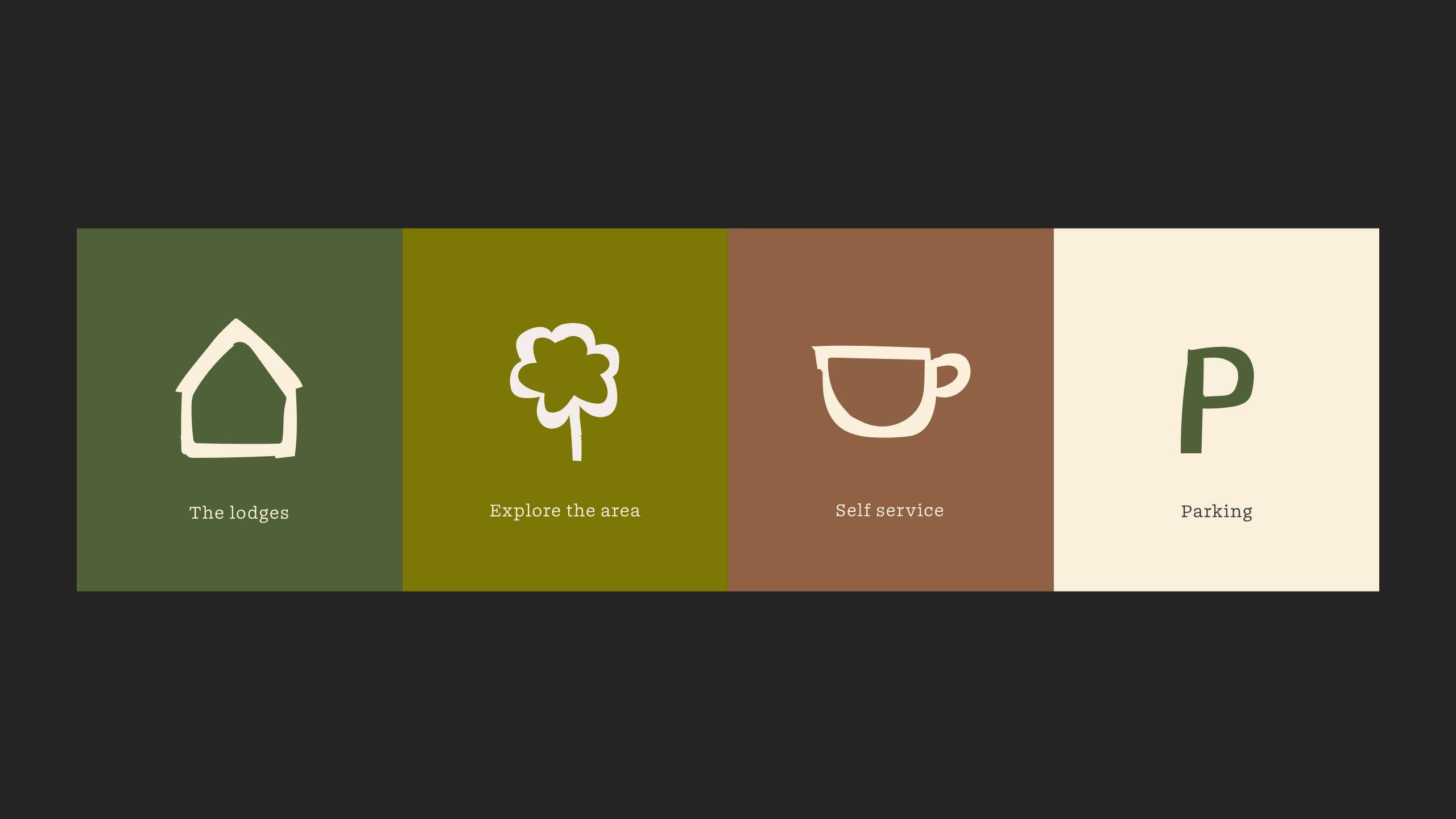
Tactile icons
WOODZ's icons appear to be constructed with wood, creating a tactile and natural feel. The design is not strictly delineated, emphasizing the connection to nature and the rustic nature of the resort.
This organic approach to icons combined with the tighter logo creates a balanced visual system, harmoniously blending natural and modern elements.
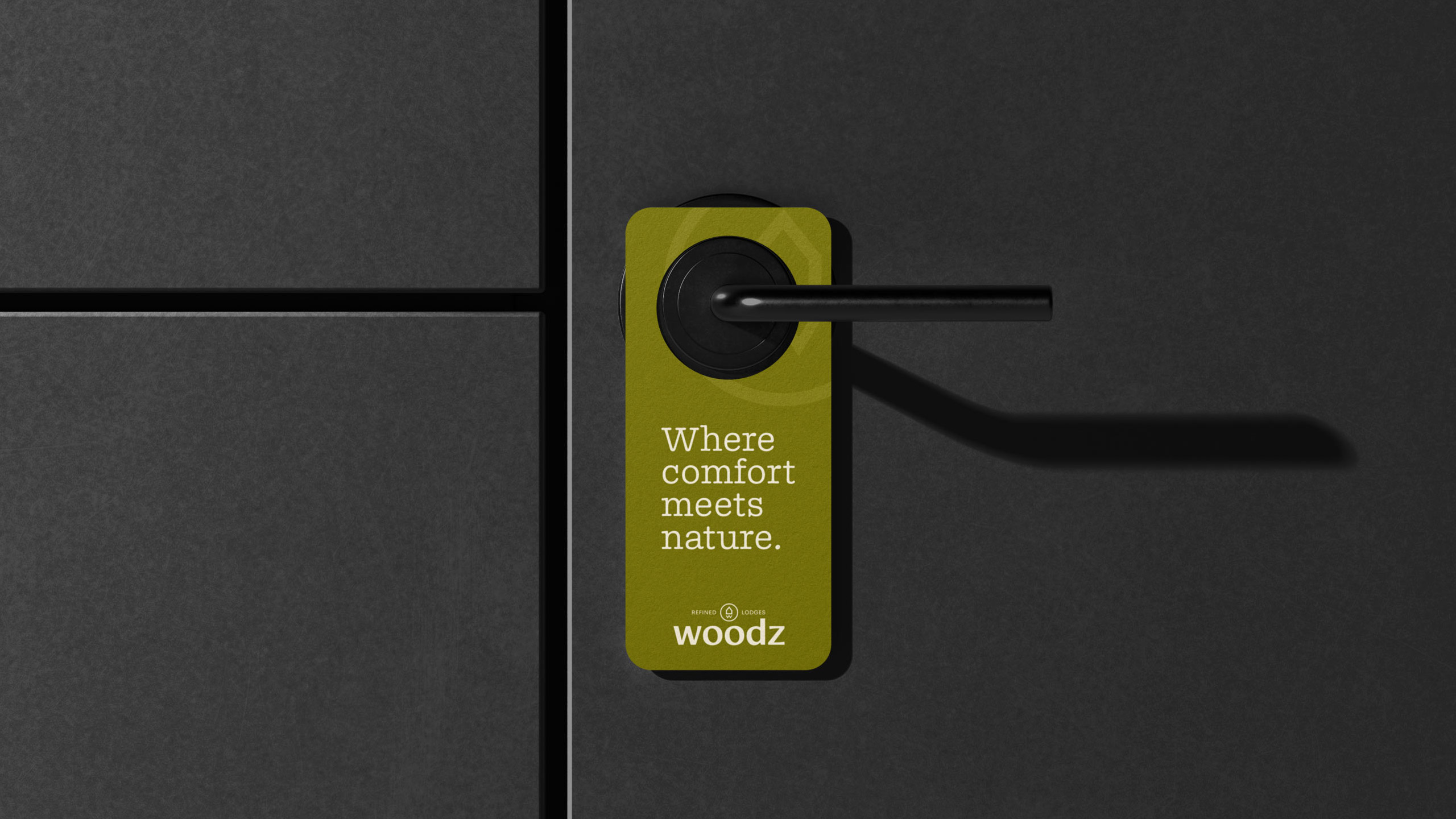
The use of creative copy resonates with the brand's core values. Slogans such as "Where comfort meets nature" and "Unwind in Nature" anchor the essence of WOODZ while establishing an emotional connection.
Each phrase is an invitation to escape, relax and embrace the harmony between comfort and nature.
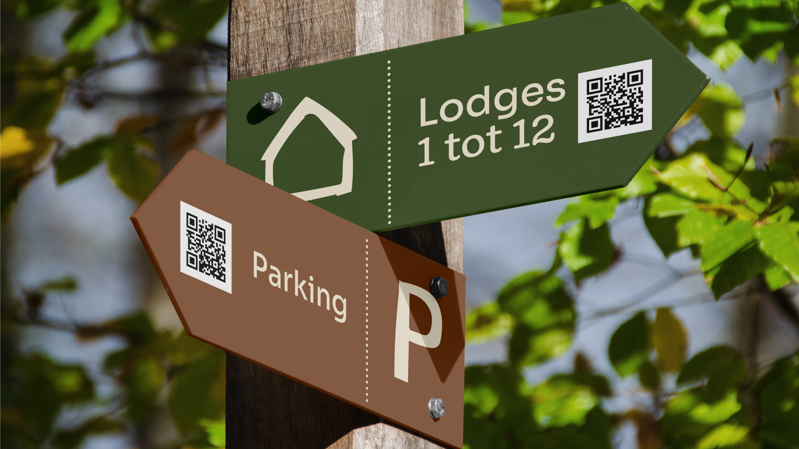
Exceptions
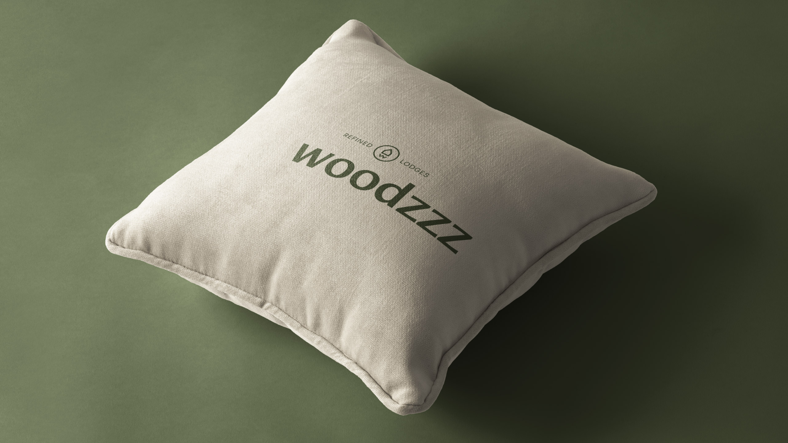
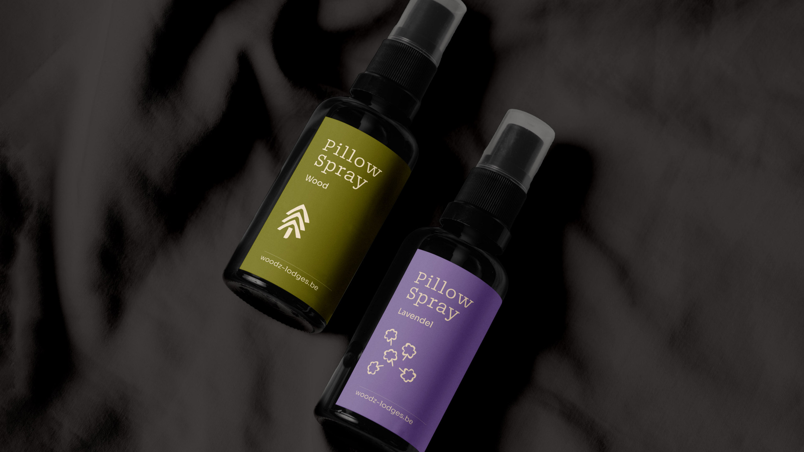
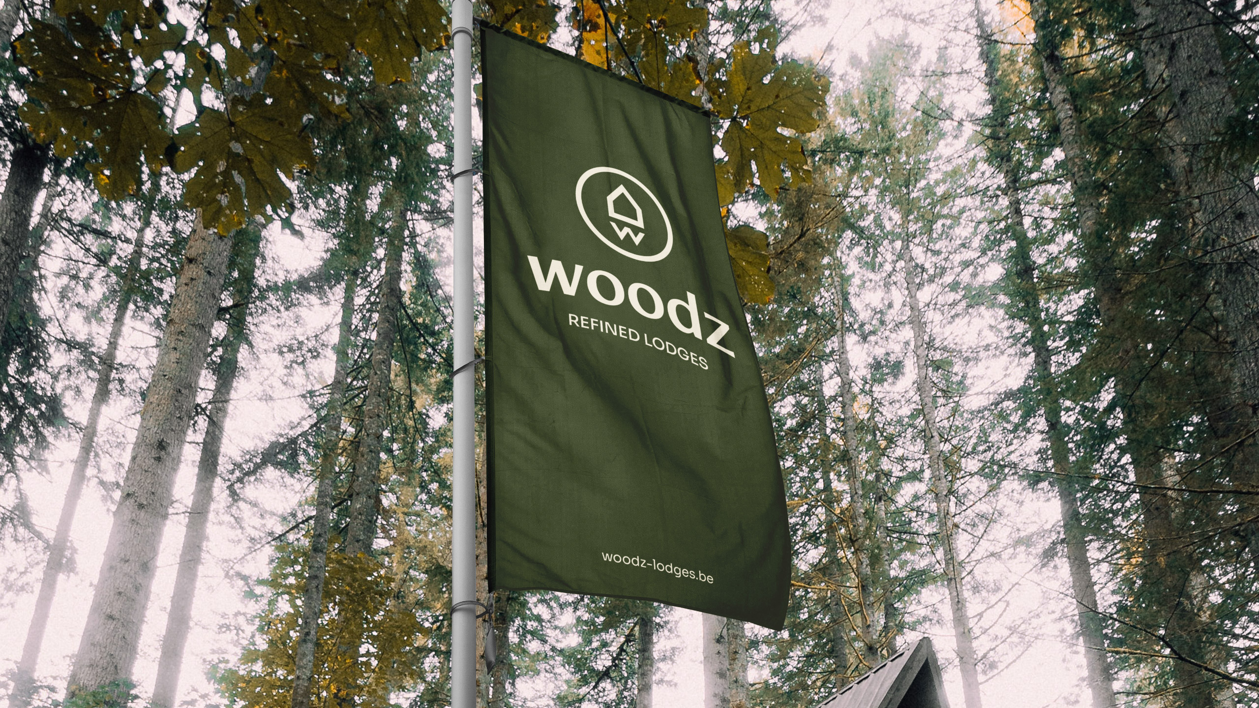
Pillows with "WOODZZZZ," subtle directional signs, flapping flags. Even the door hangers add to the overall picture, with every detail designed to create an unforgettable experience that is right down to the smallest detail.