Buur&Berg
A DIFFERENT WAY OF LIVING
Buur&Berg (meaning Neighbour&Mountain) marks a new chapter on the historic Sint-Anna site in Sint-Truiden (Belgium). The neighbourhood offers a unique combination of living and working. With the aim of creating connections between people, generations and caring initiatives. We created a branding that suits all these targets, while radiating the necessary freshness.
Website
buurenberg.be
The name Buur&Berg reflects the essence of the project: a sustainable living environment in the centre of Sint-Truiden.
'Buur' emphasizes neighbourliness and social connection. The ampersand symbolizes the connection between the people and the location.
While 'Berg' refers to the physical location, the Stenaertberg.
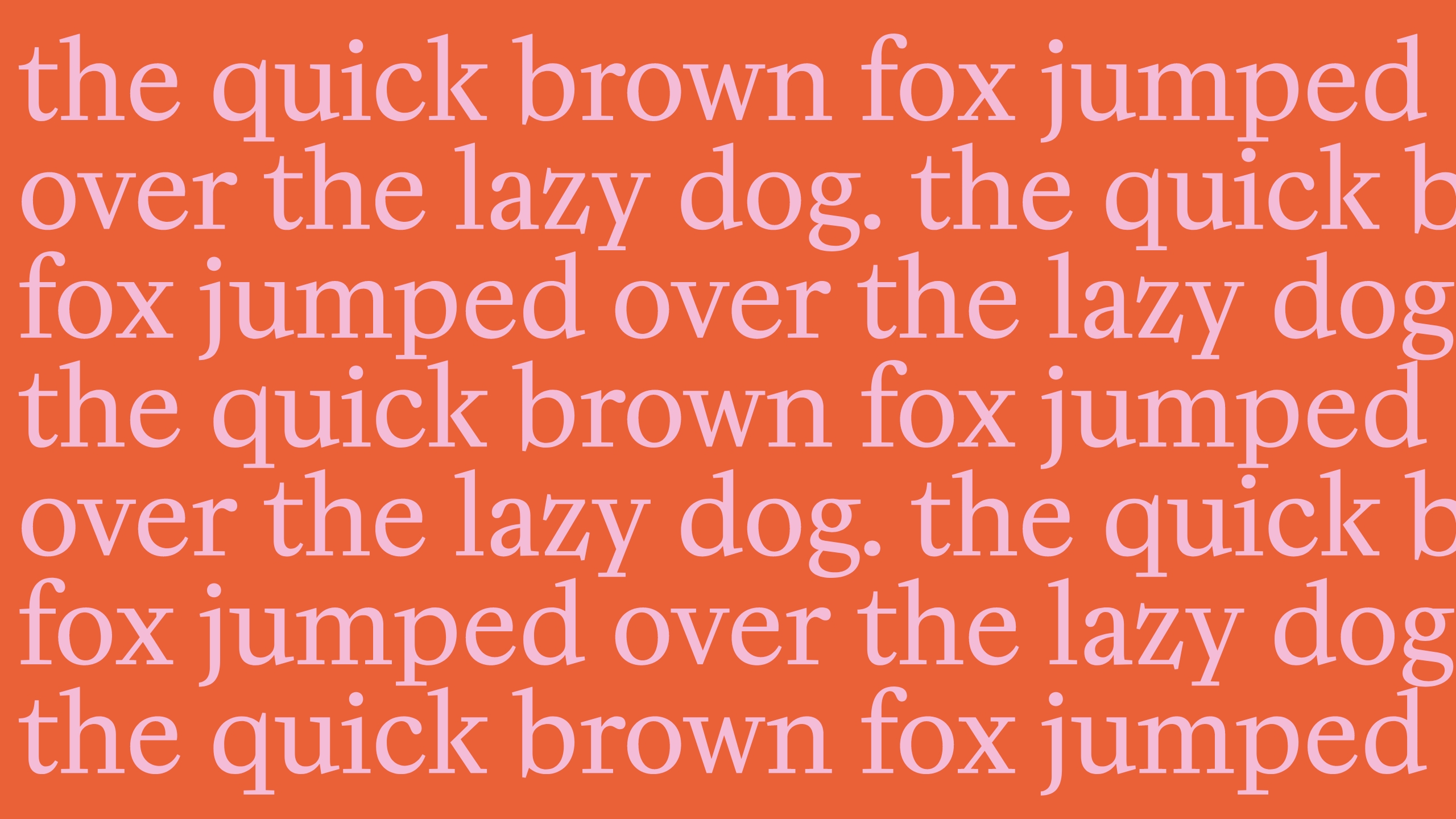
Logo and Visual Identity
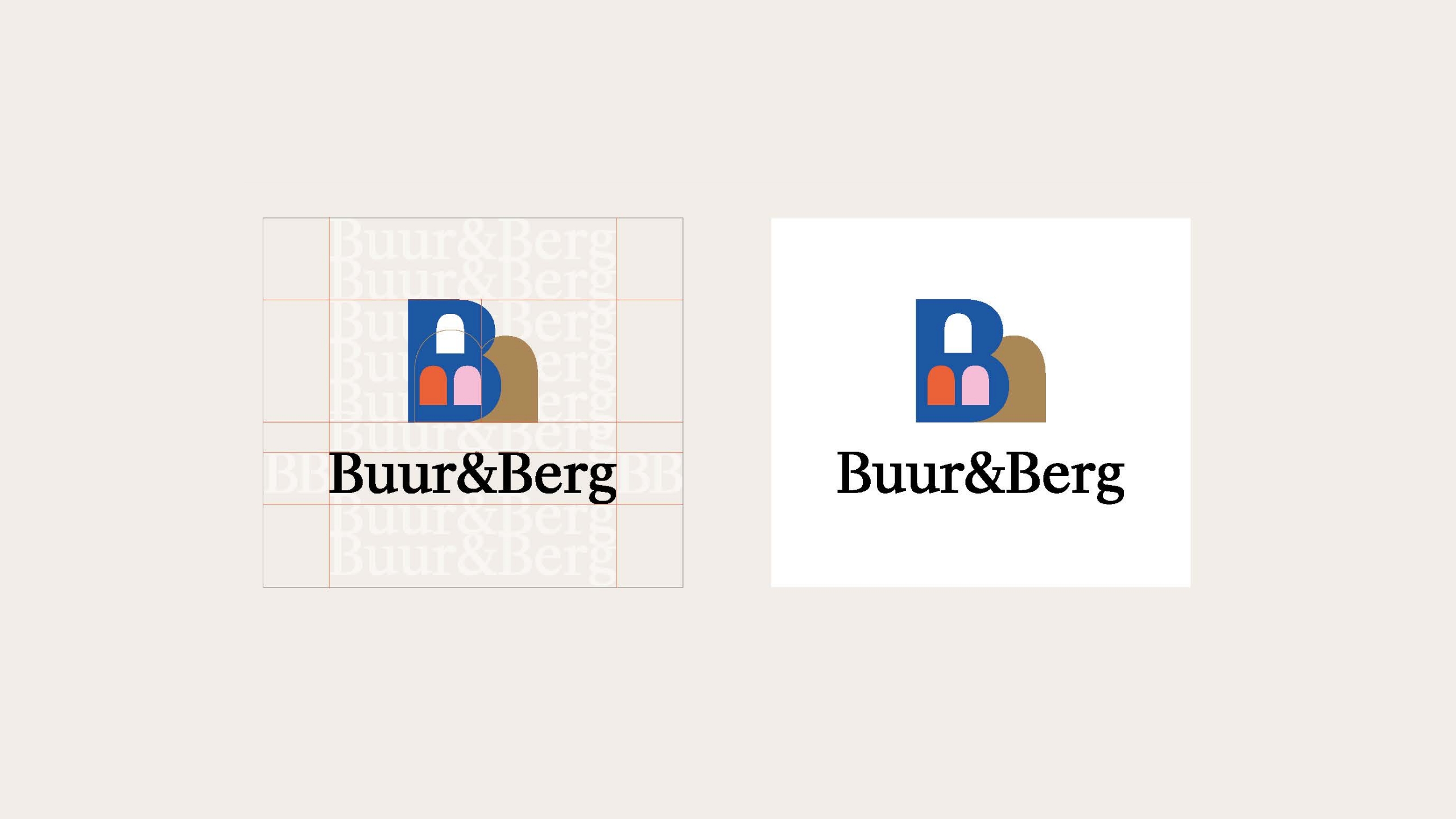
The logo is composed of a symbol (2 overlapping B's) :
- B upright: reference to buildings and neighbours.
- B lying down: reference to mountain and green character.
The typography can be placed either horizontally or vertically next to the symbol.


Baseline, colours and illustrations
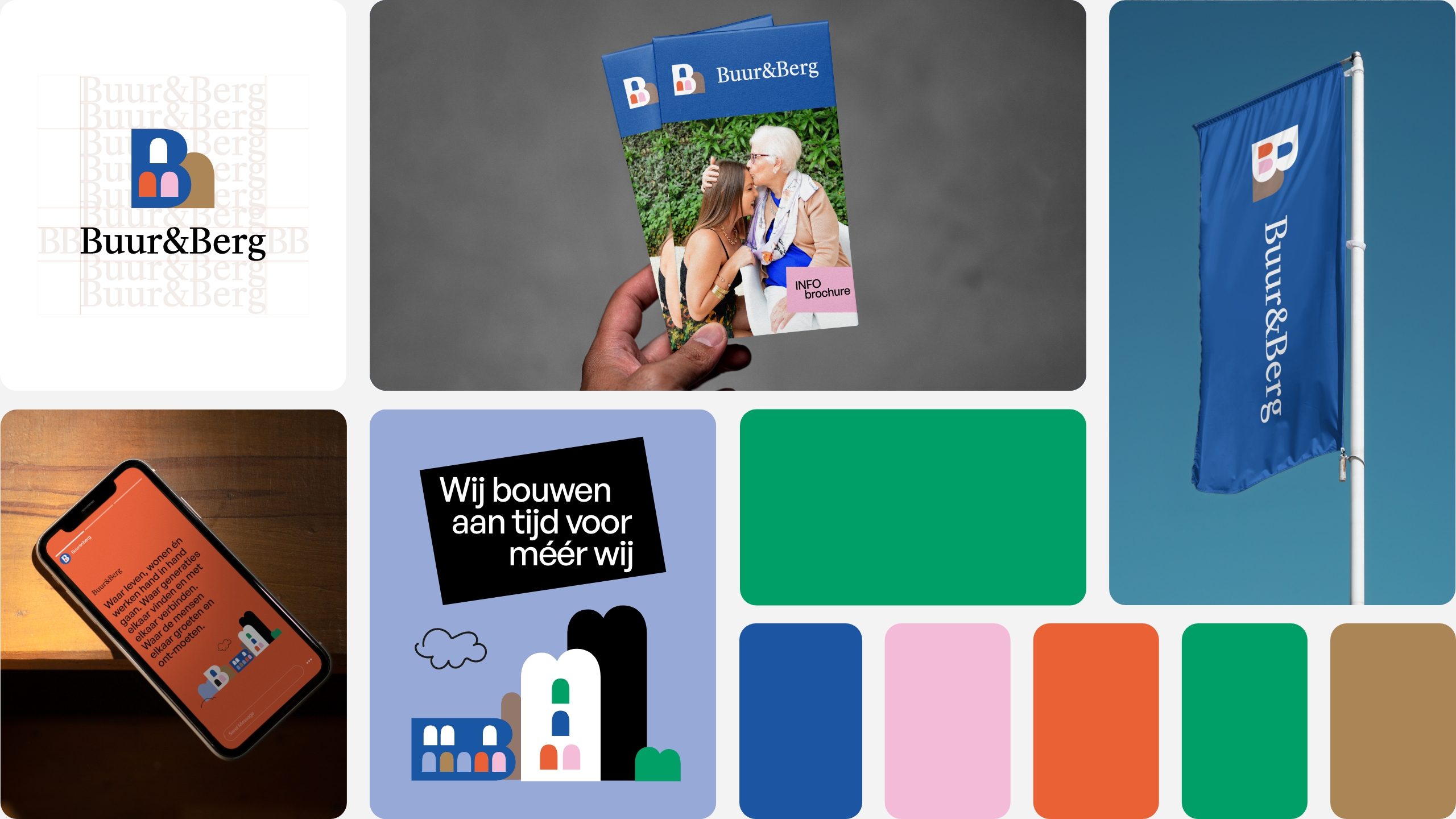
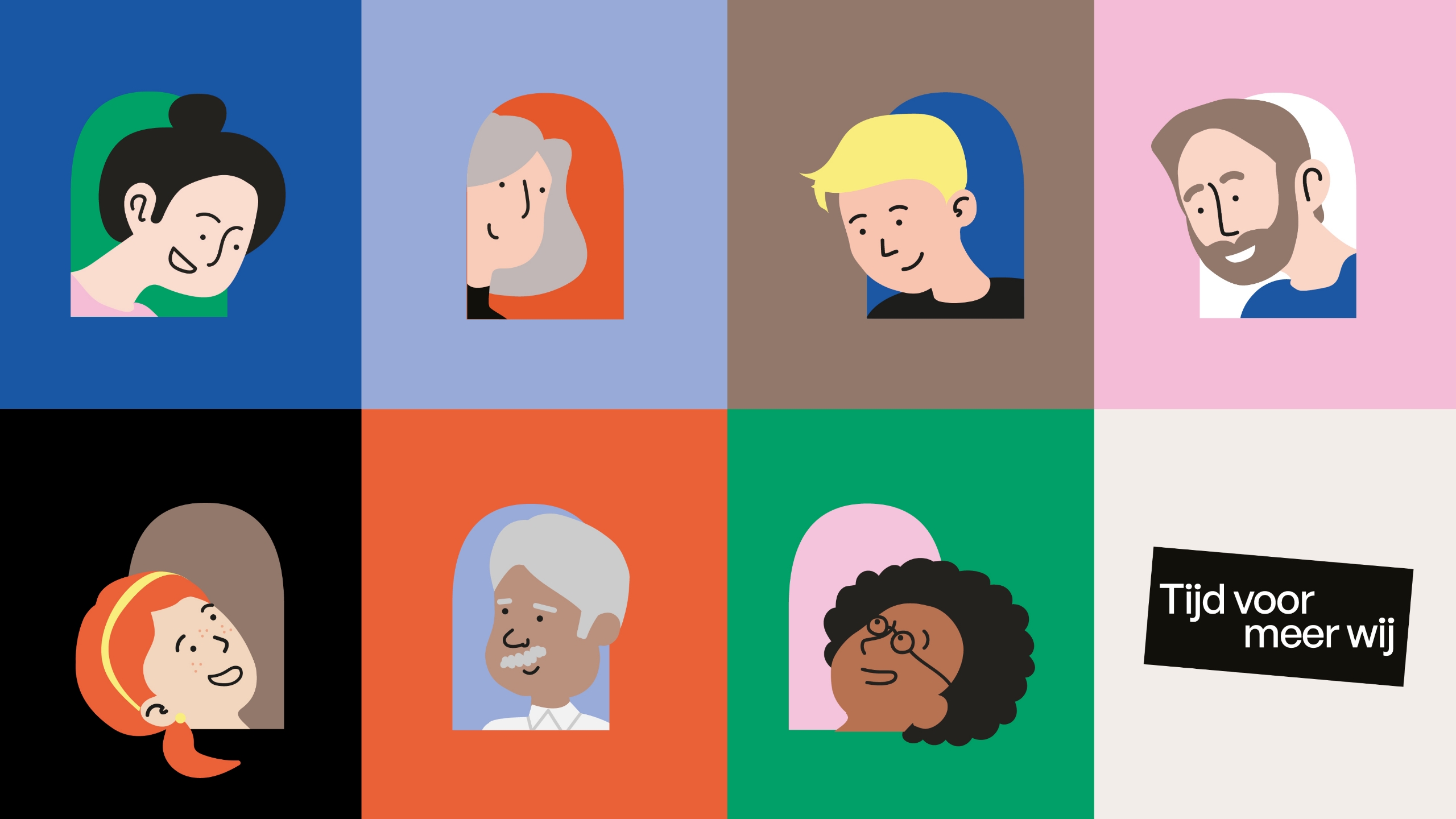
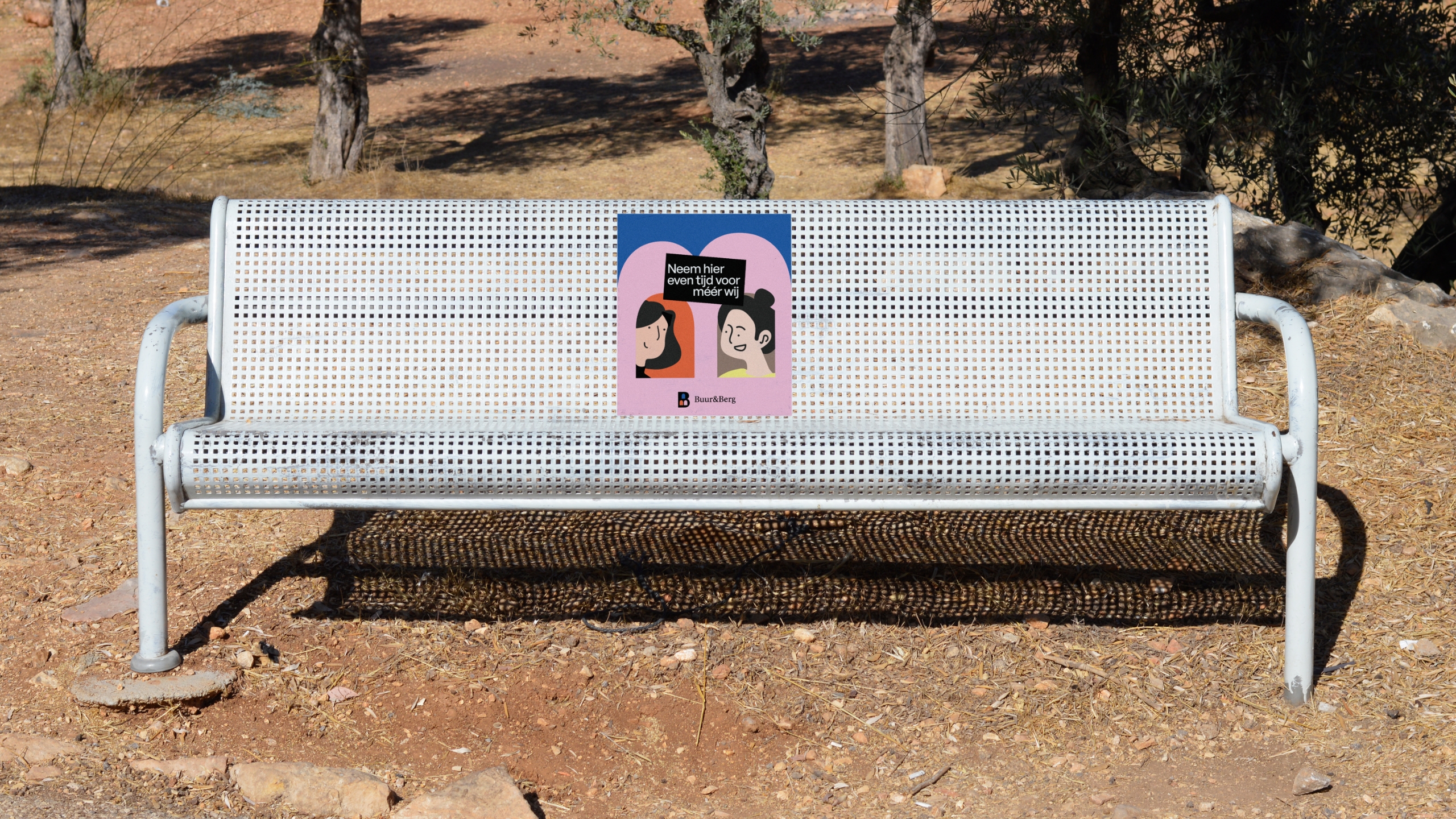
The baseline 'tijd voor meer wij' (meaning 'More time for us') emphasizes the importance of community and living together. With a focus on connectedness and living at one's own pace.
The frivolous, fresh colour palette with soft colours emphasises the human character of the project.
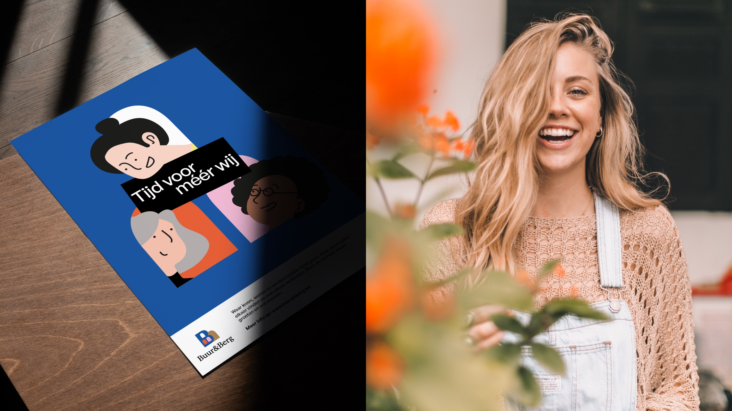
The illustrated 'neighbours' give the branding a fresh, playful and 'human' touch. These characters allow us to portray a very diverse audience.
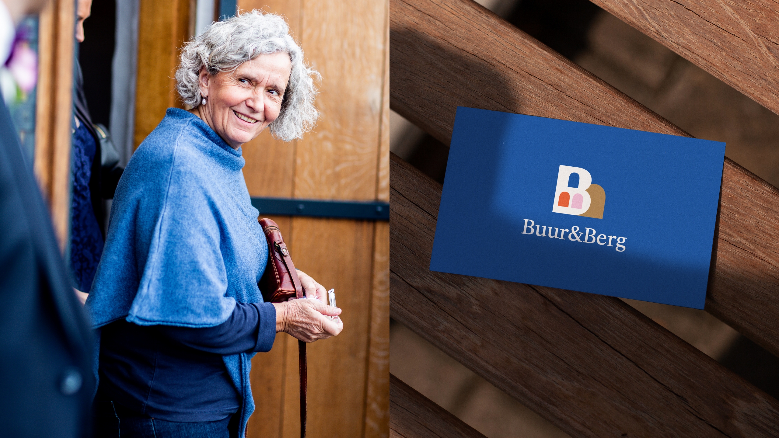

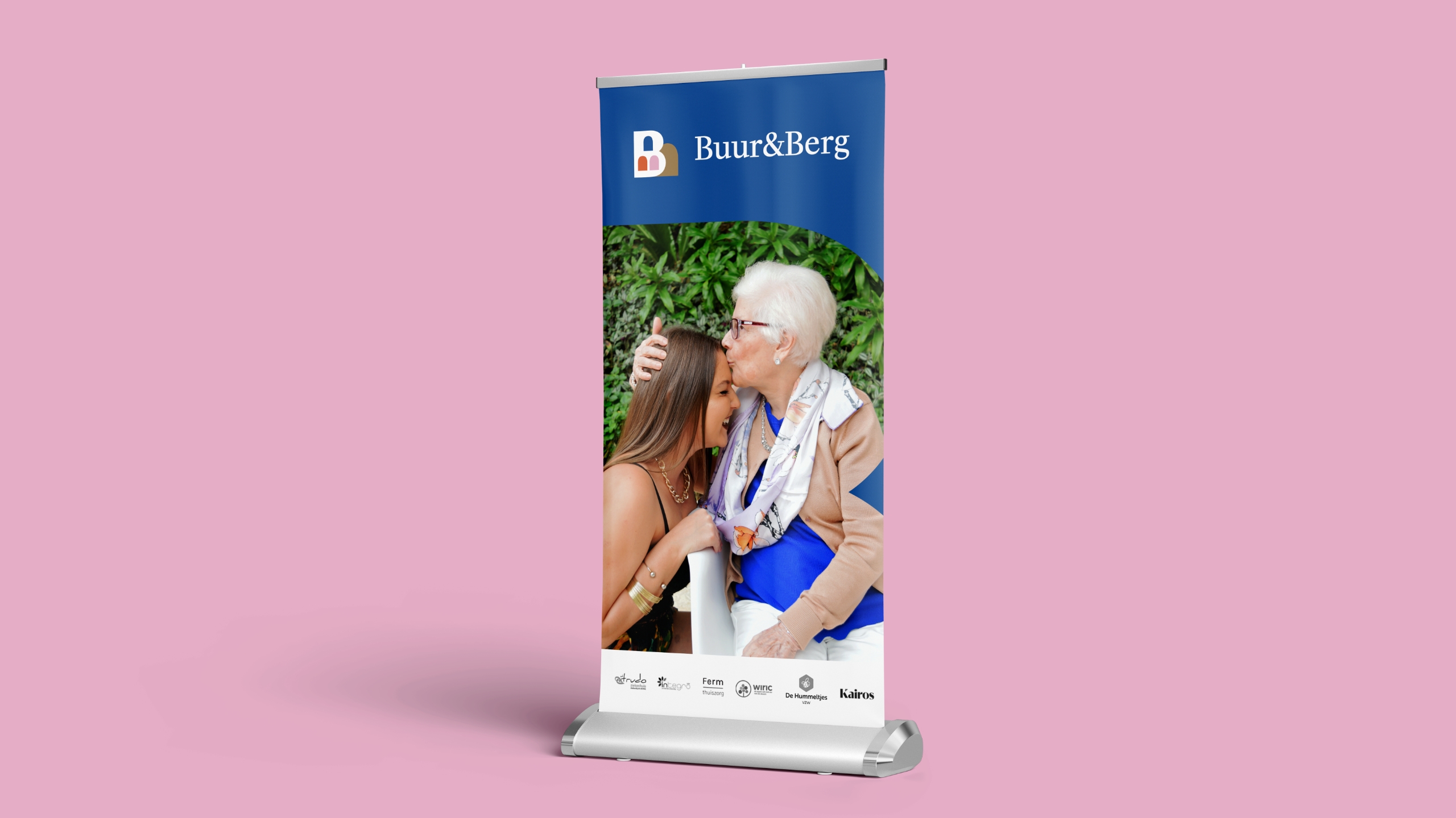
We show the real people who live at Buur&Berg. That way, we create a fresh, recognizable and very diverse atmosphere in the photography.
