Saamo
REBRANDING, RENAMING & BRAND ARCHITECTURE
The branding process for non-profit often differs from commercial enterprises. This was the case for Saamo - previously known as 'Samenwerkingsopbouw'.
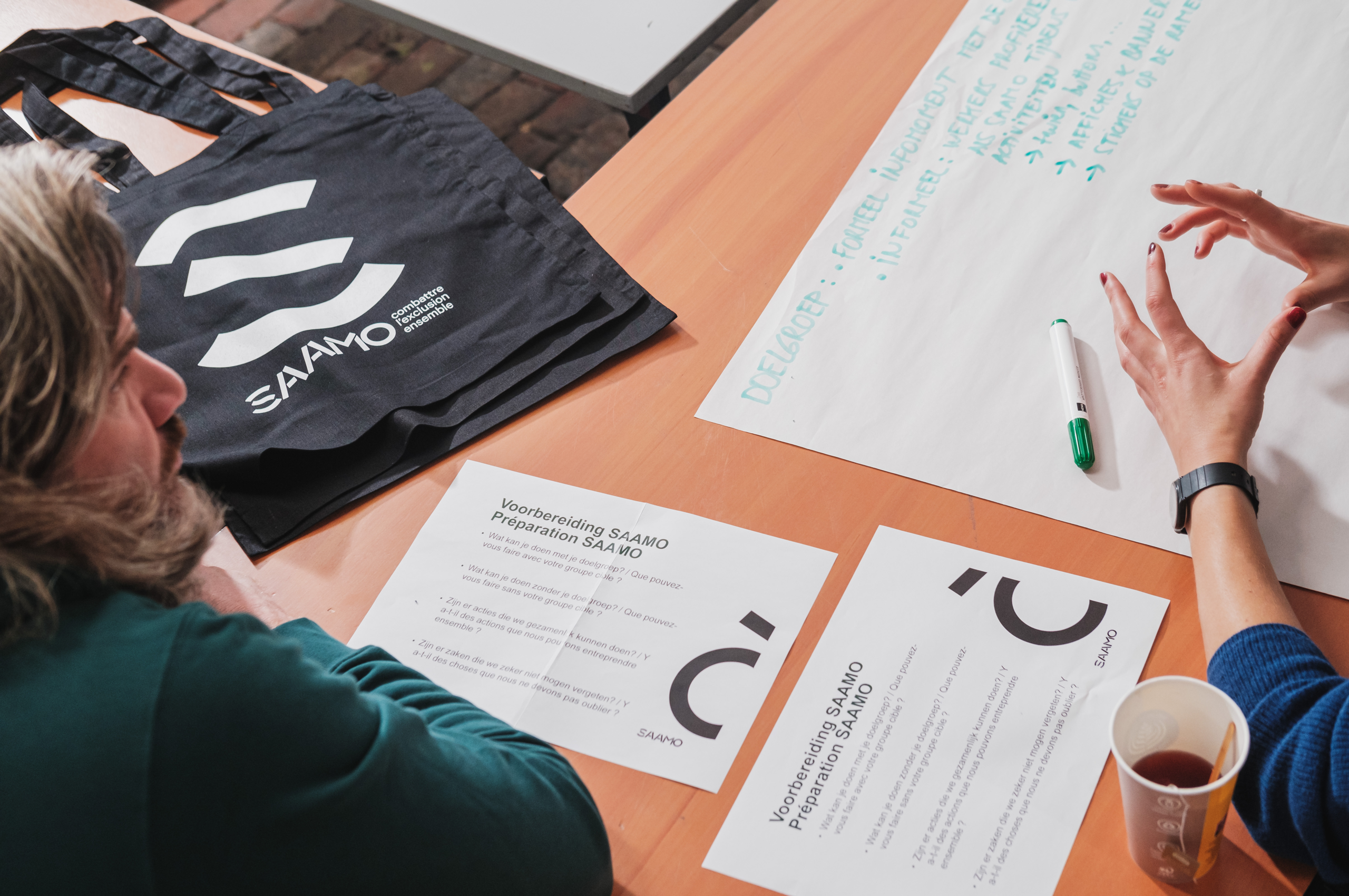
Saamo is a conglomerate of many community development centers. As such, we had a manifold of people chime in on the process, each with their own ideas. This presented us with a challenge …
Challenge accepted!
The objective?
- Unite the different centers
- Think of a new brand name
- Create a system to simplify the complex structures
- Design visual identity that stands out
Name
Saamo ran into issues with their name 'Samenlevingsopbouw', as a long and complex word. Moreover, their name was just an explanation of what they offered.
Among dozens of names, the team settled on 'Saamo' — a simple composition of parts of 'Samenlevingsopbouw'. But now turned into a catchy, abstract and memorable name.
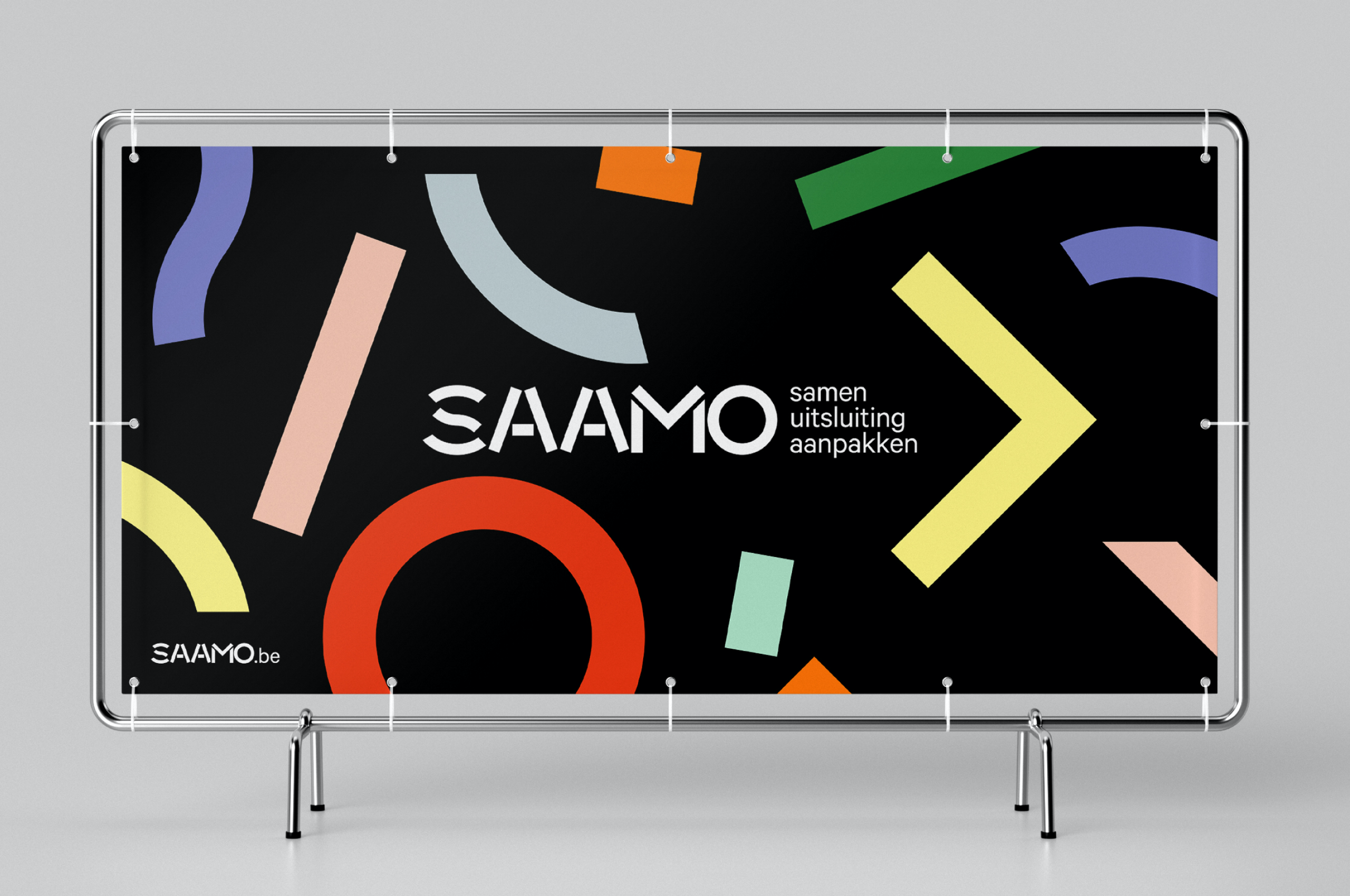
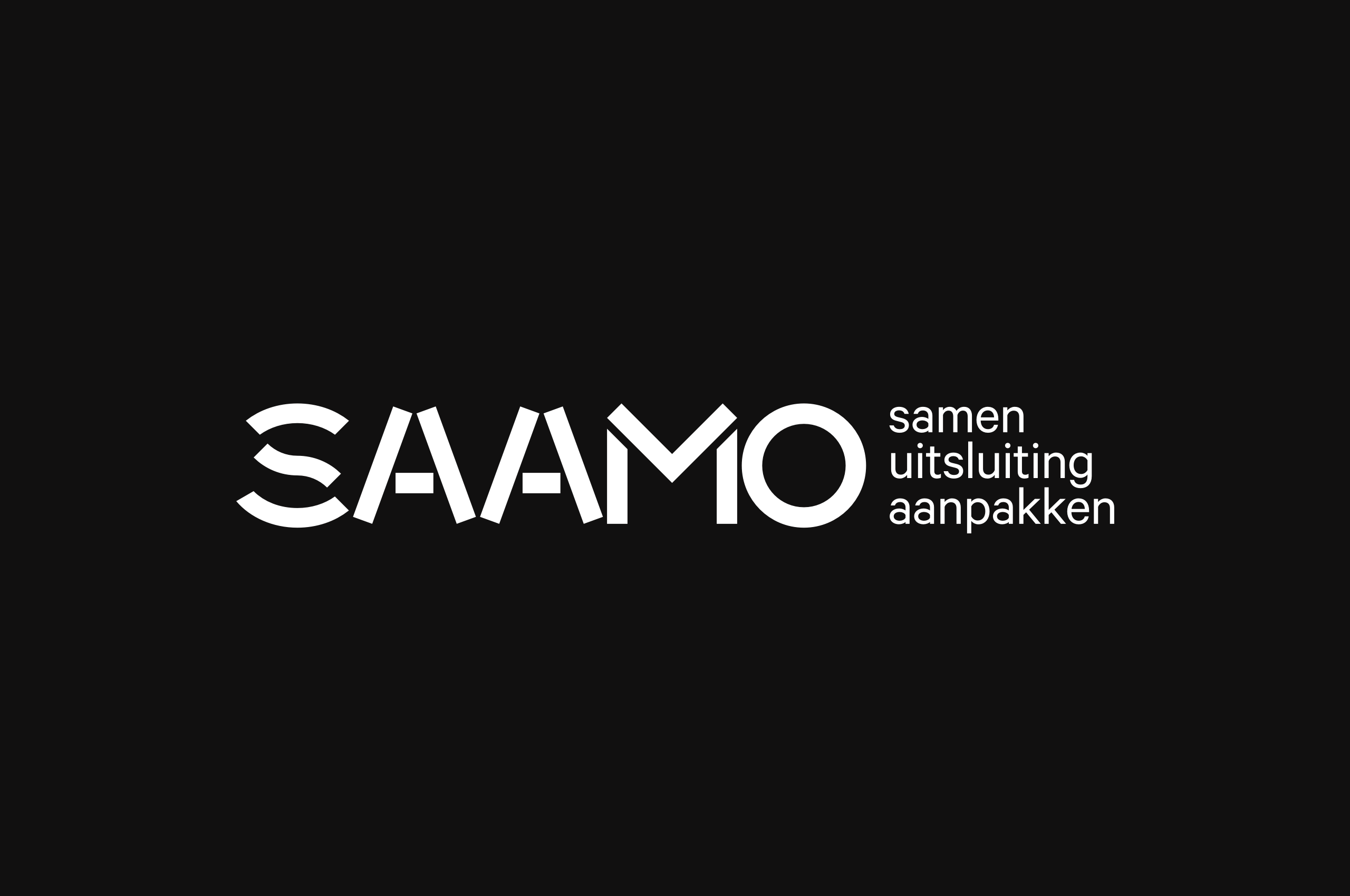
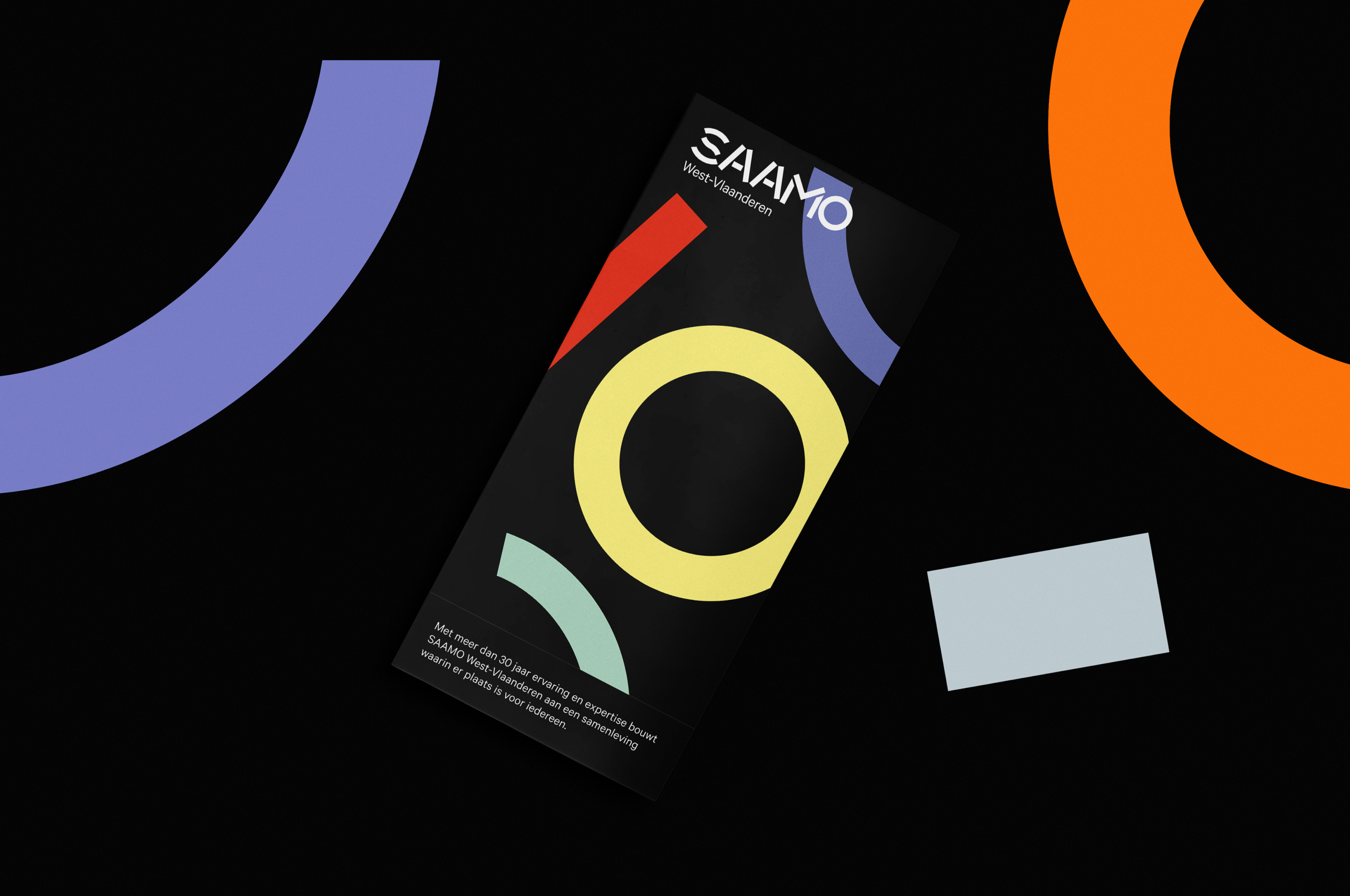
Visual concept
'Saamo', although catchy, perhaps sounded a little gentle. We balanced this out by adding a dose of 'toughness', leading to designing the tougher 'Brave Warrior' concept.
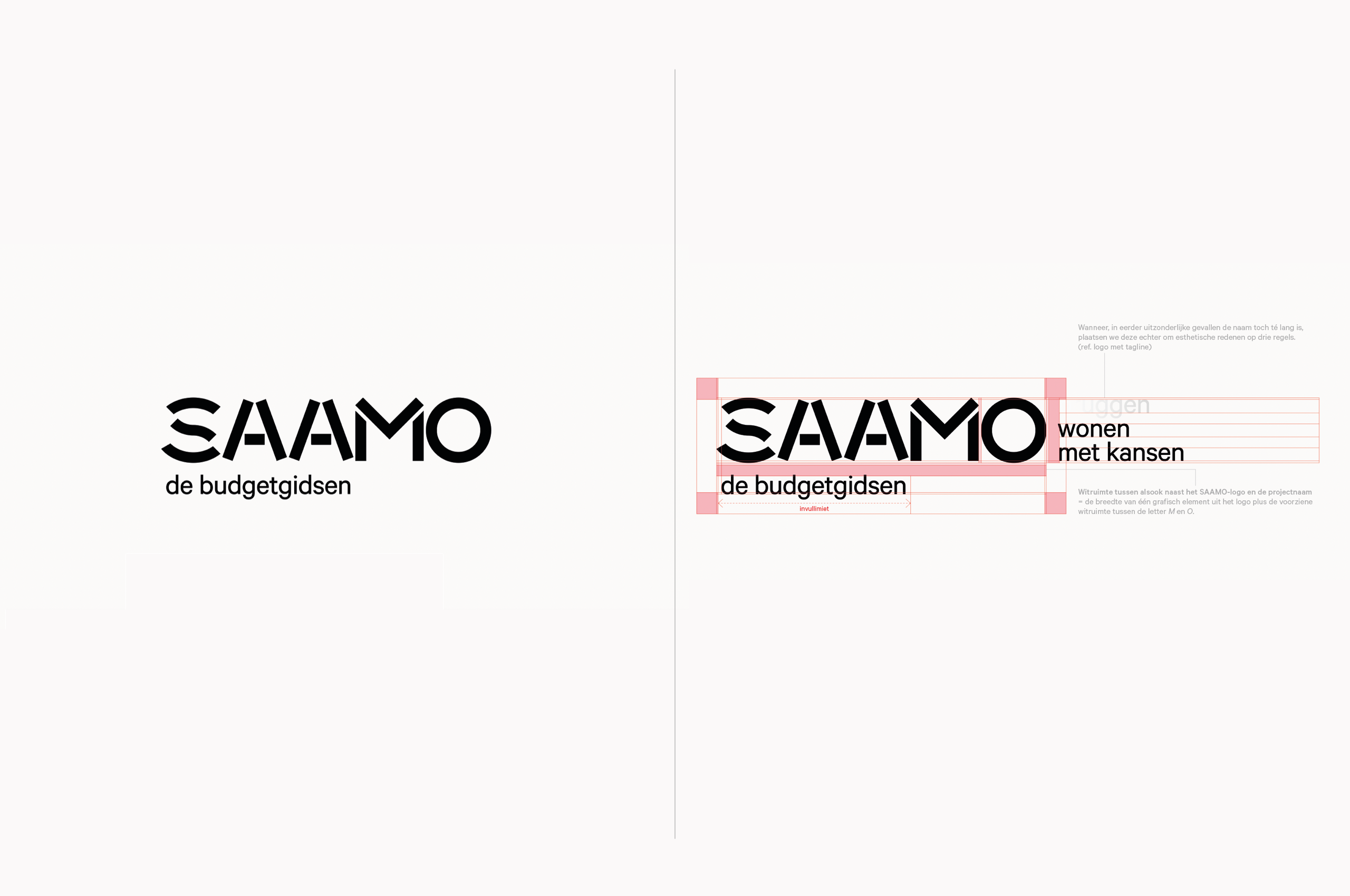
The wordmark is constructed with separate lines, resulting in a custom font boasting a powerful look.
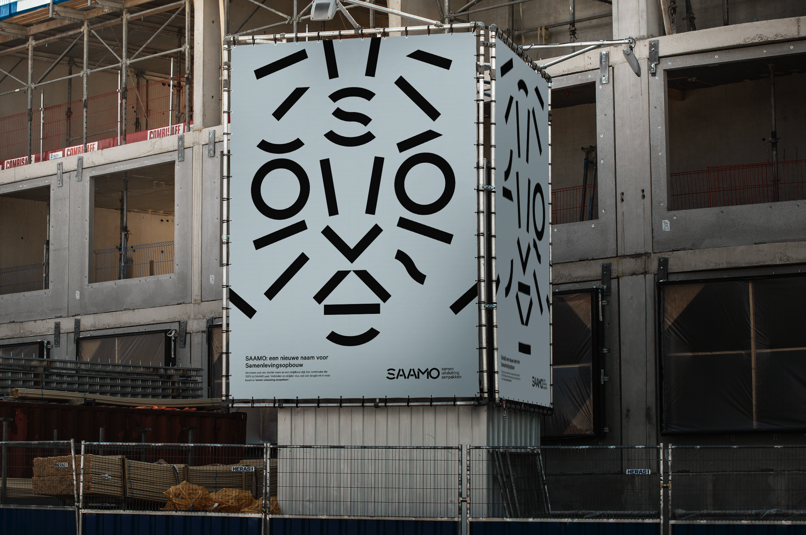
We use parts of the letters as graphic elements.
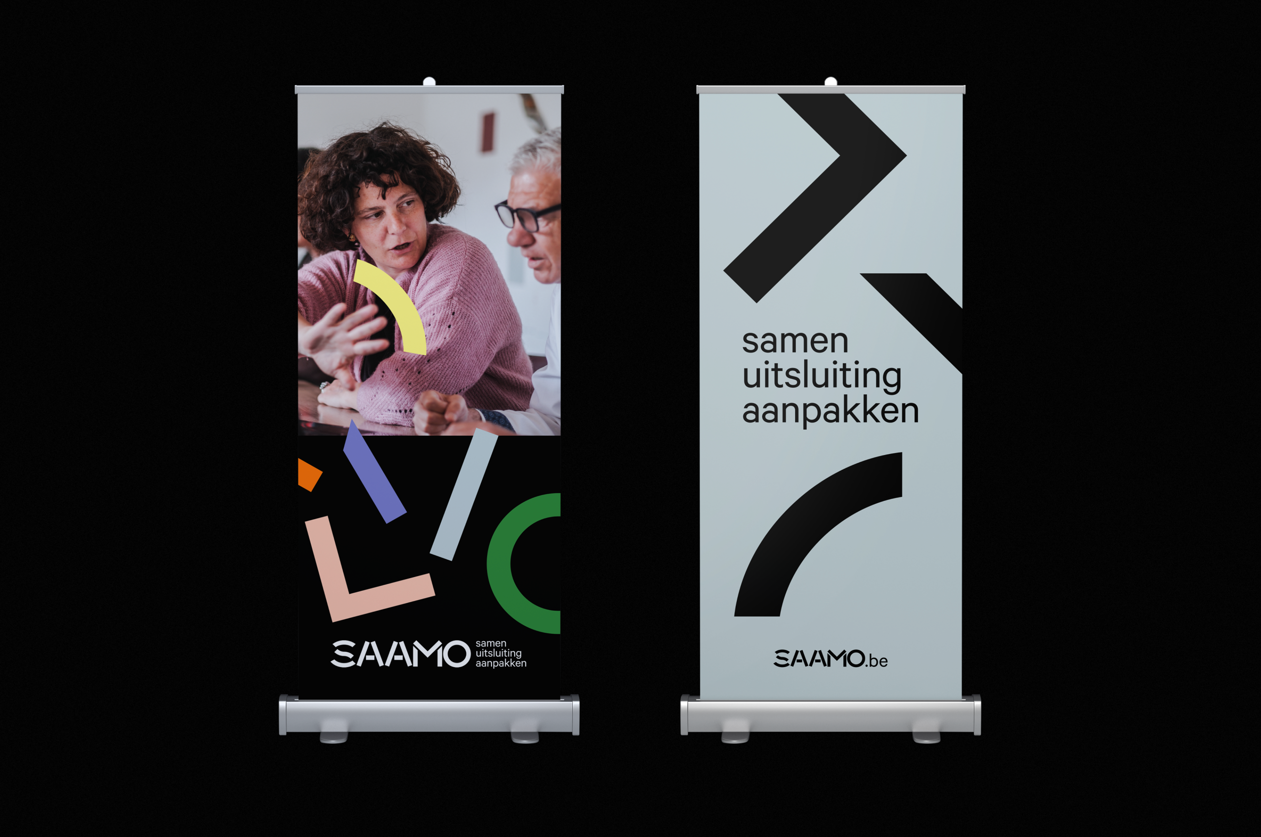
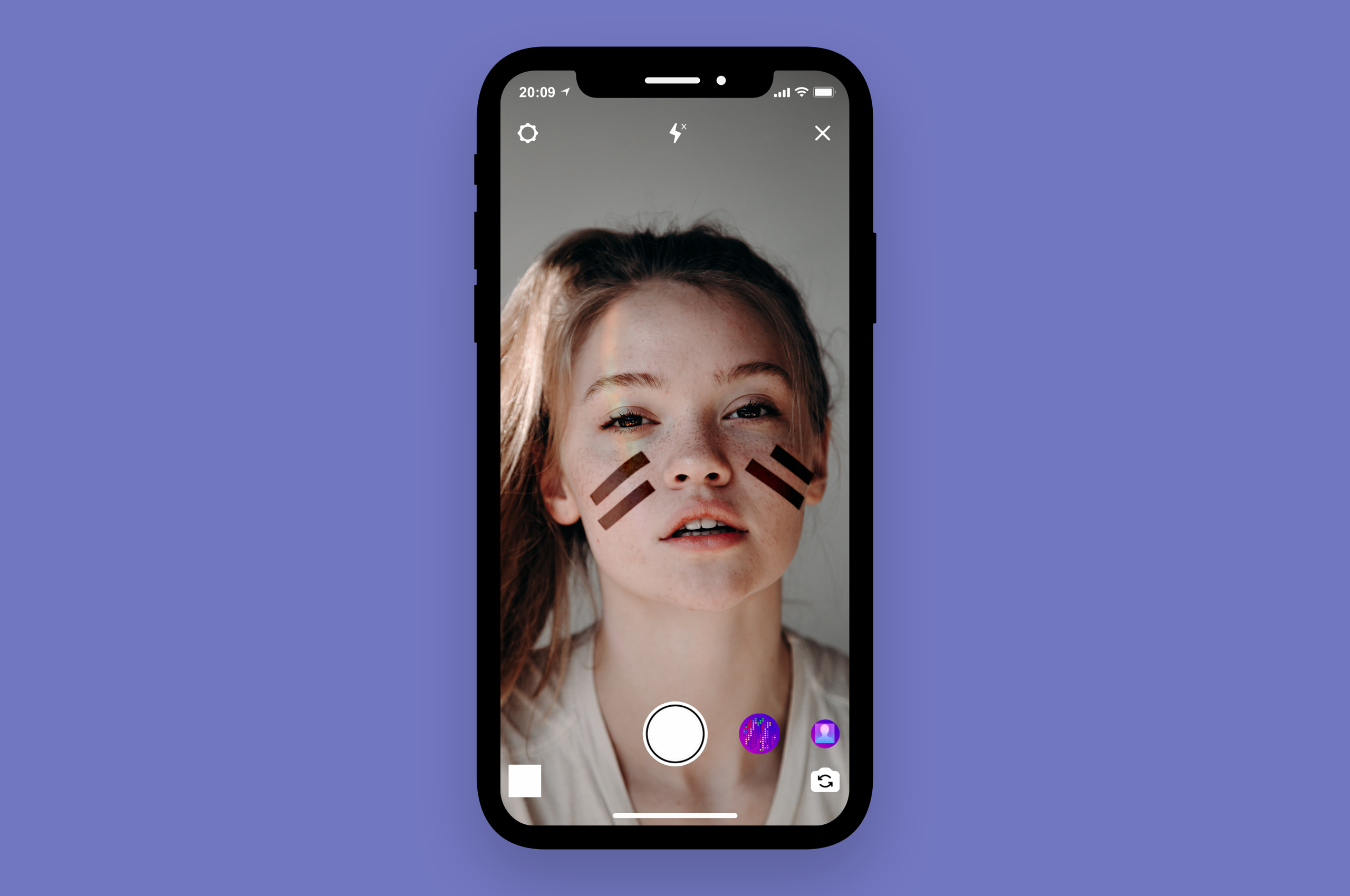
With a warrior comes "warpaint". With these marks we transform Saamo-members into 'warriors'.
Brand Architecture
During the past decades, new Saamo projects had often turned into brands of their own. Leaving their portfolio cluttered with over 100 sub-brands, to the detriment of their overarching identity.
To combat this, we created a simplified system and educated the client on the importance of recognizability, showing them that many project brands made more sense as baselines.
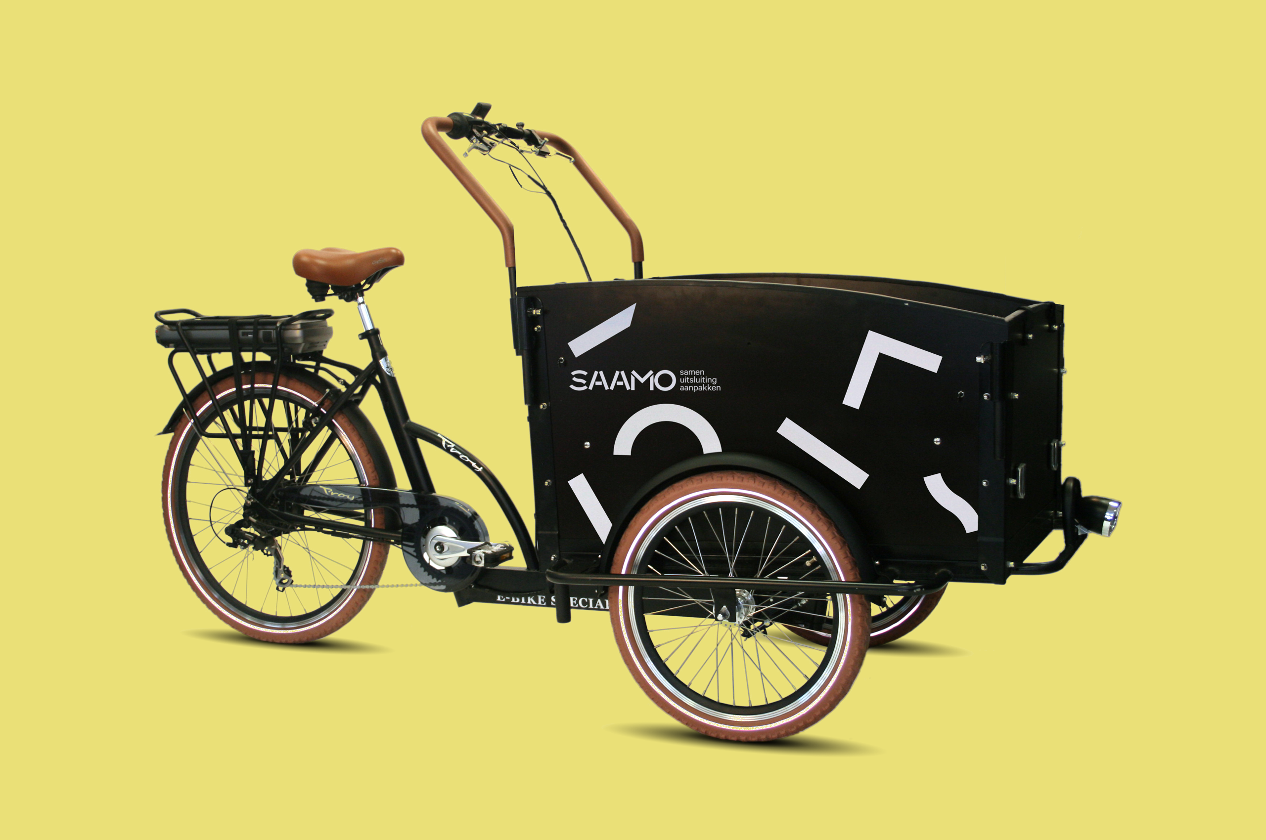
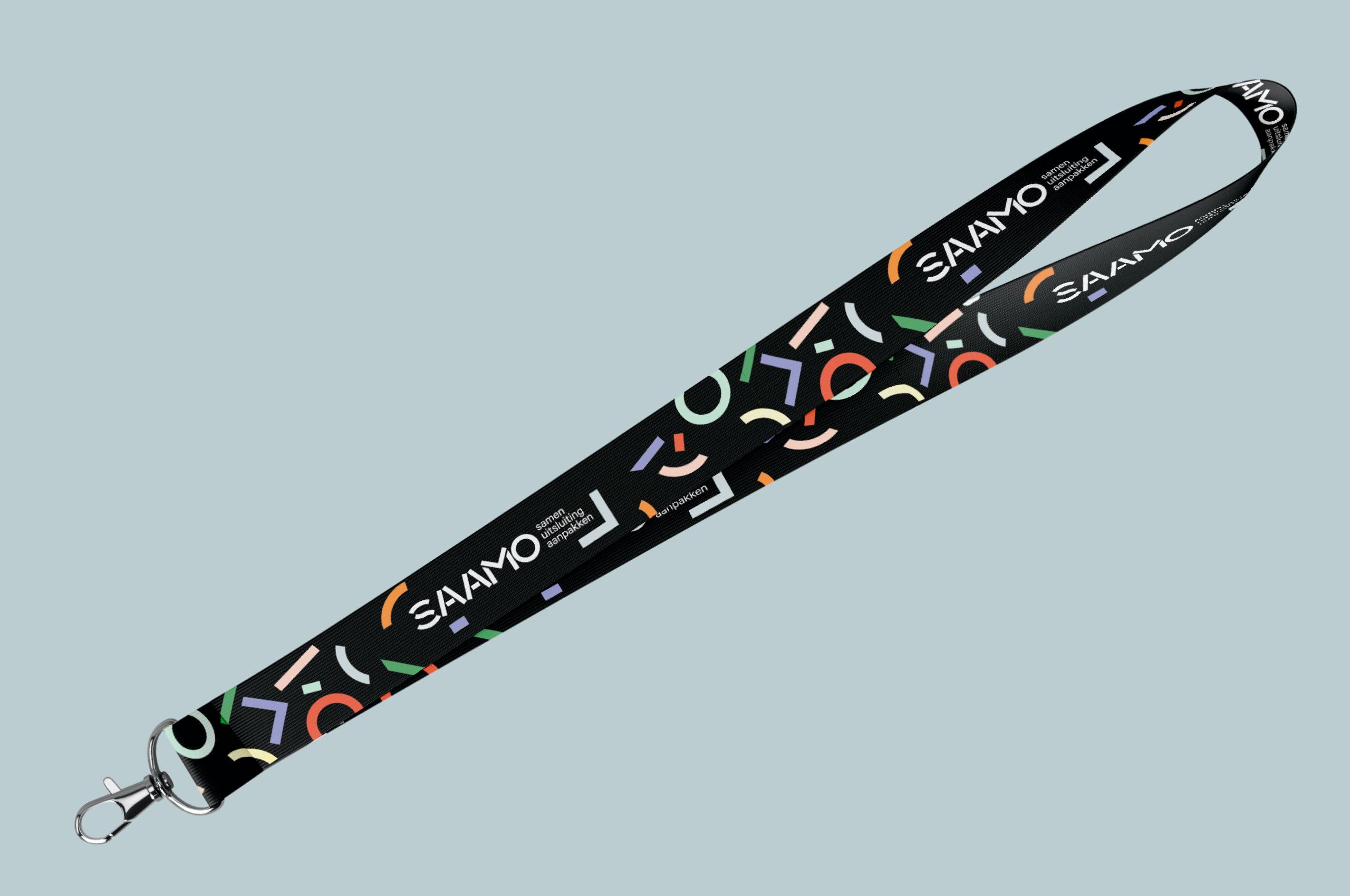
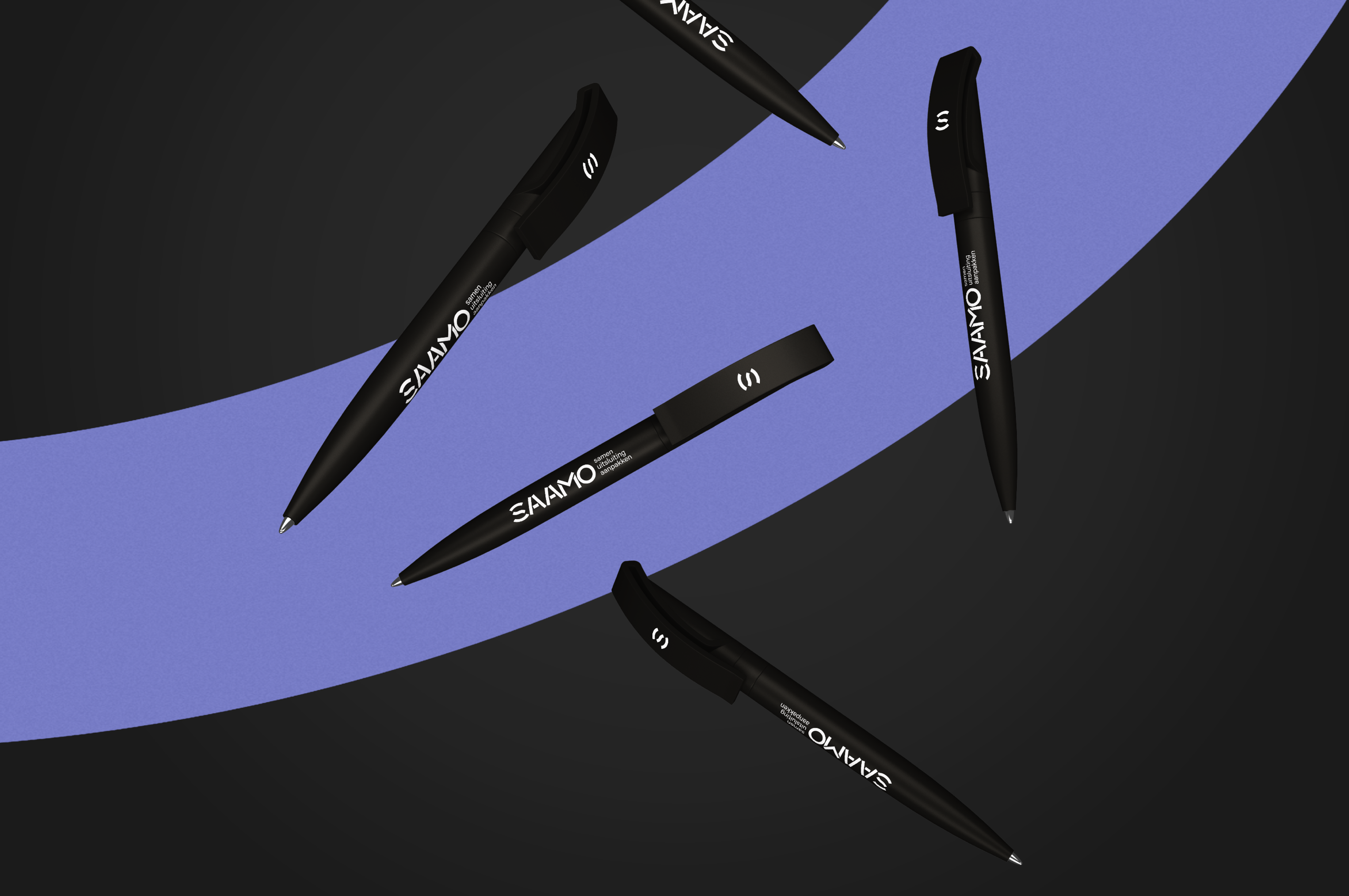
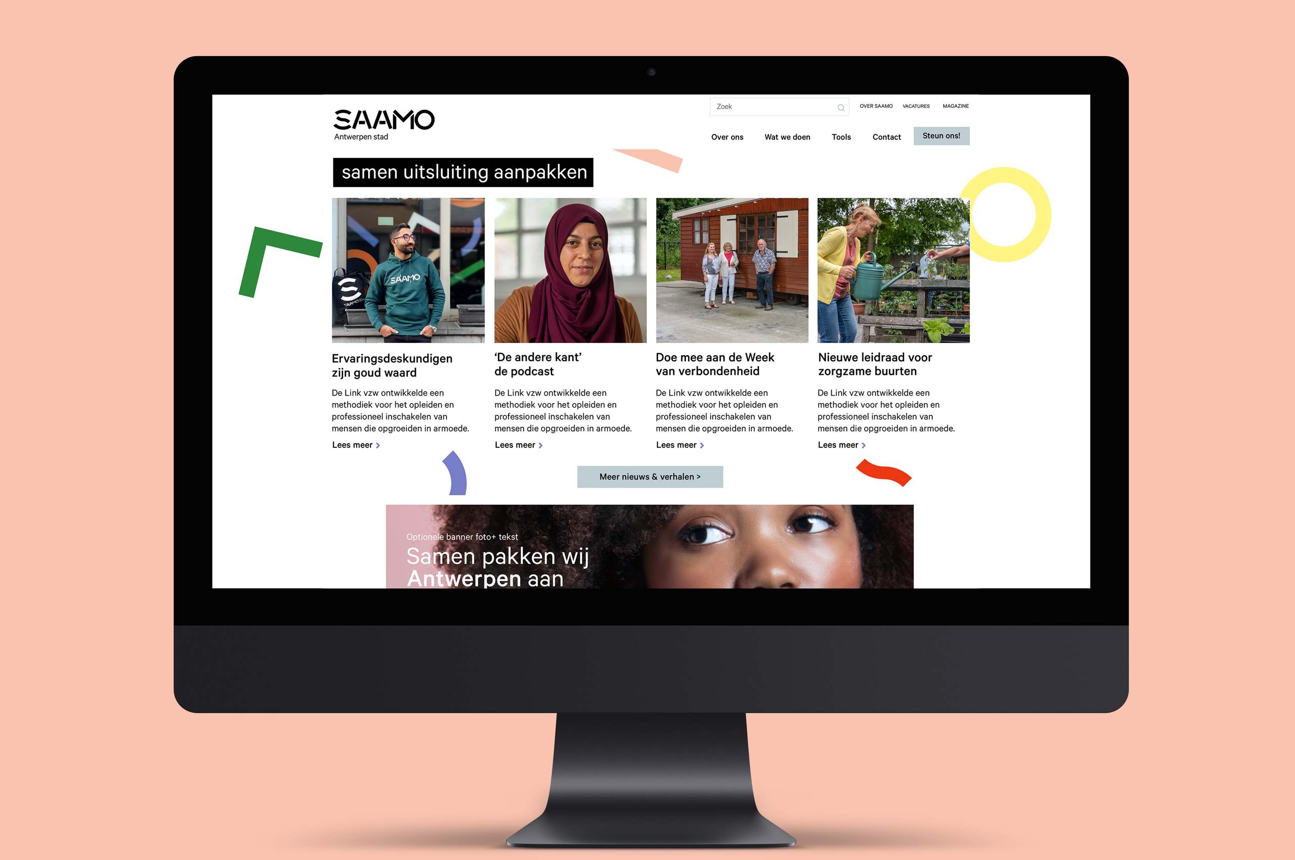
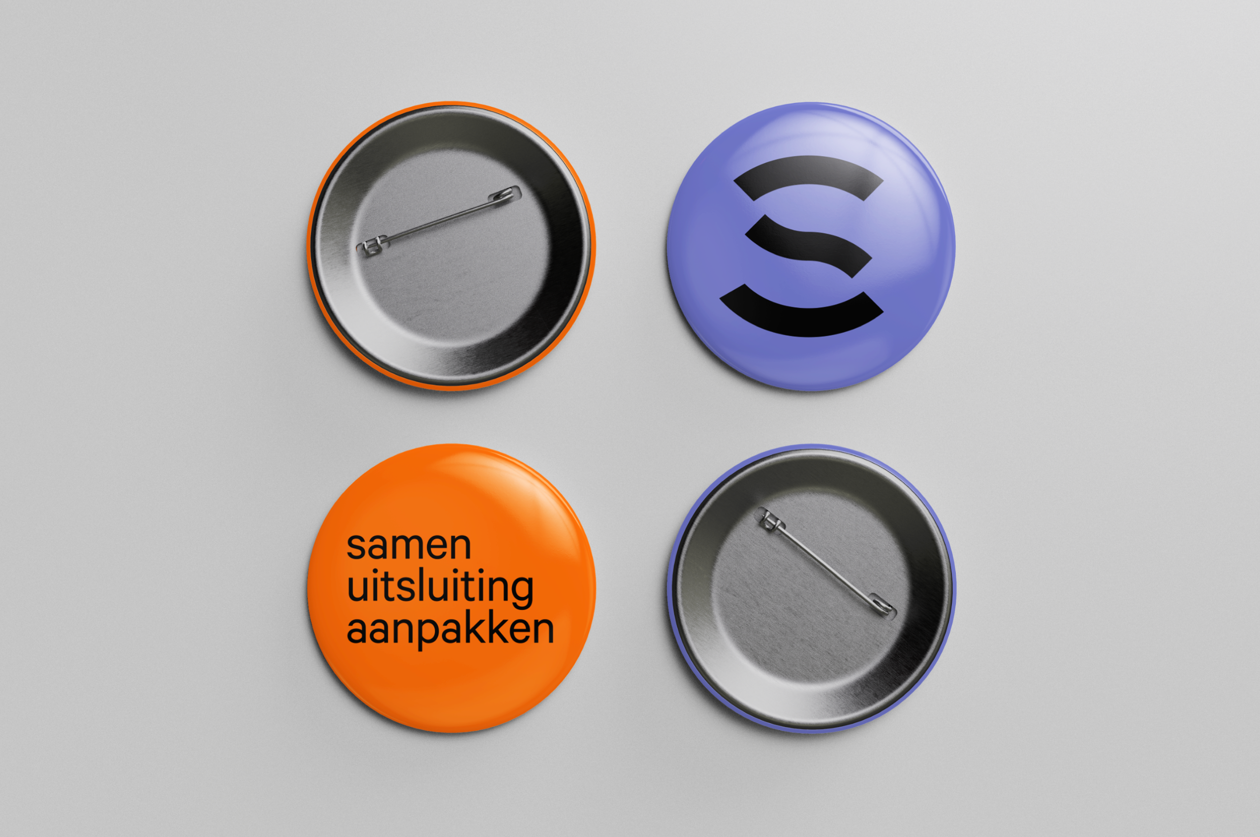
Brand artifacts
Built with parts from the word mark and color pallet: these visual icons prove helpful in brochures and the community centers.
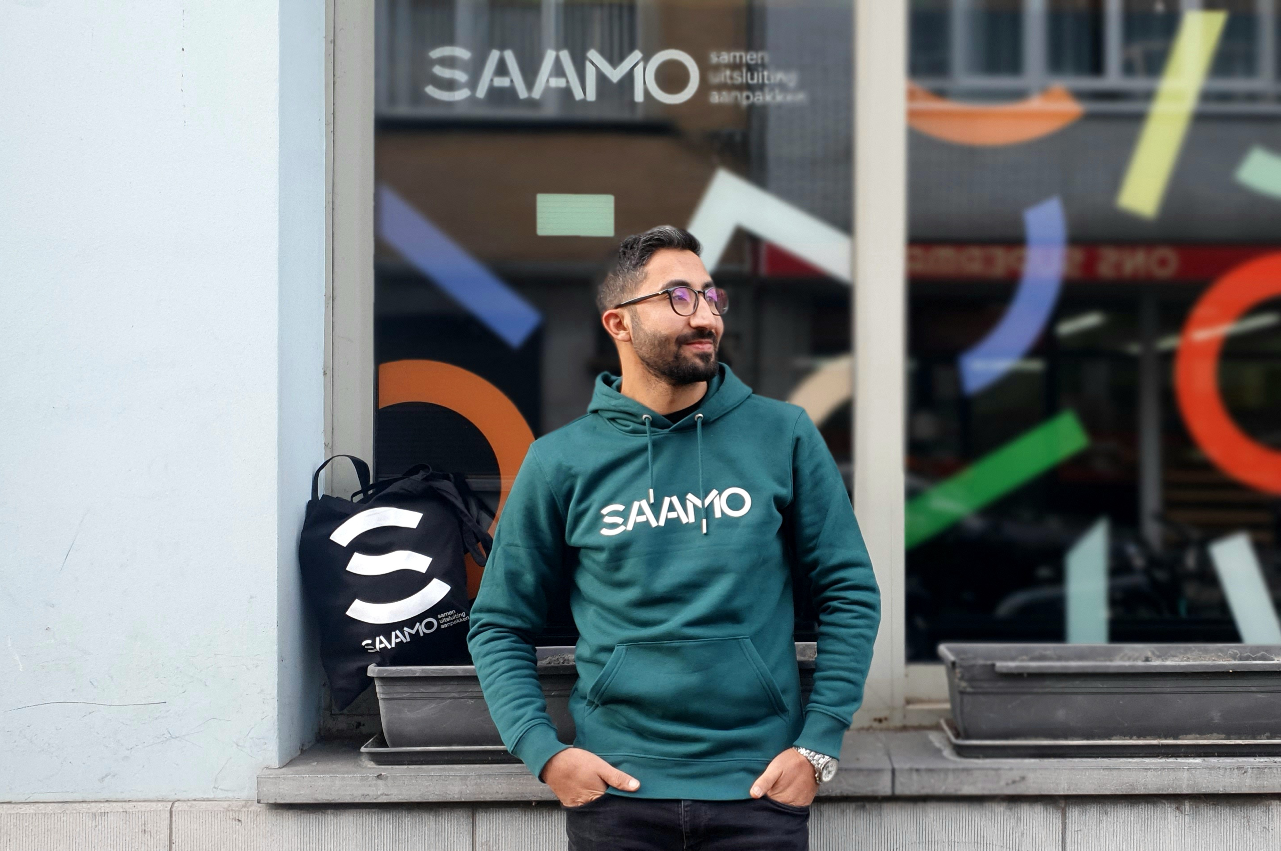
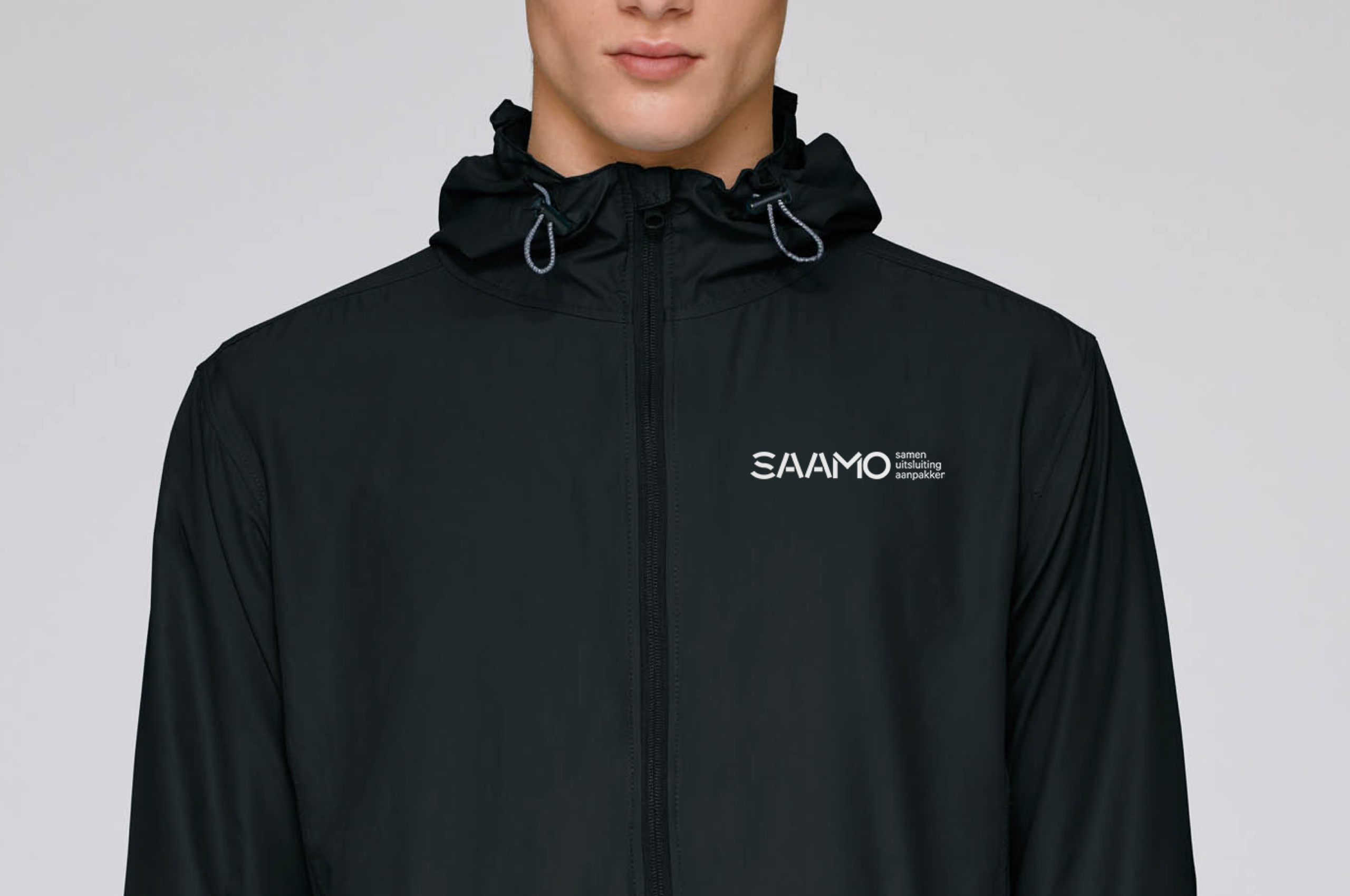
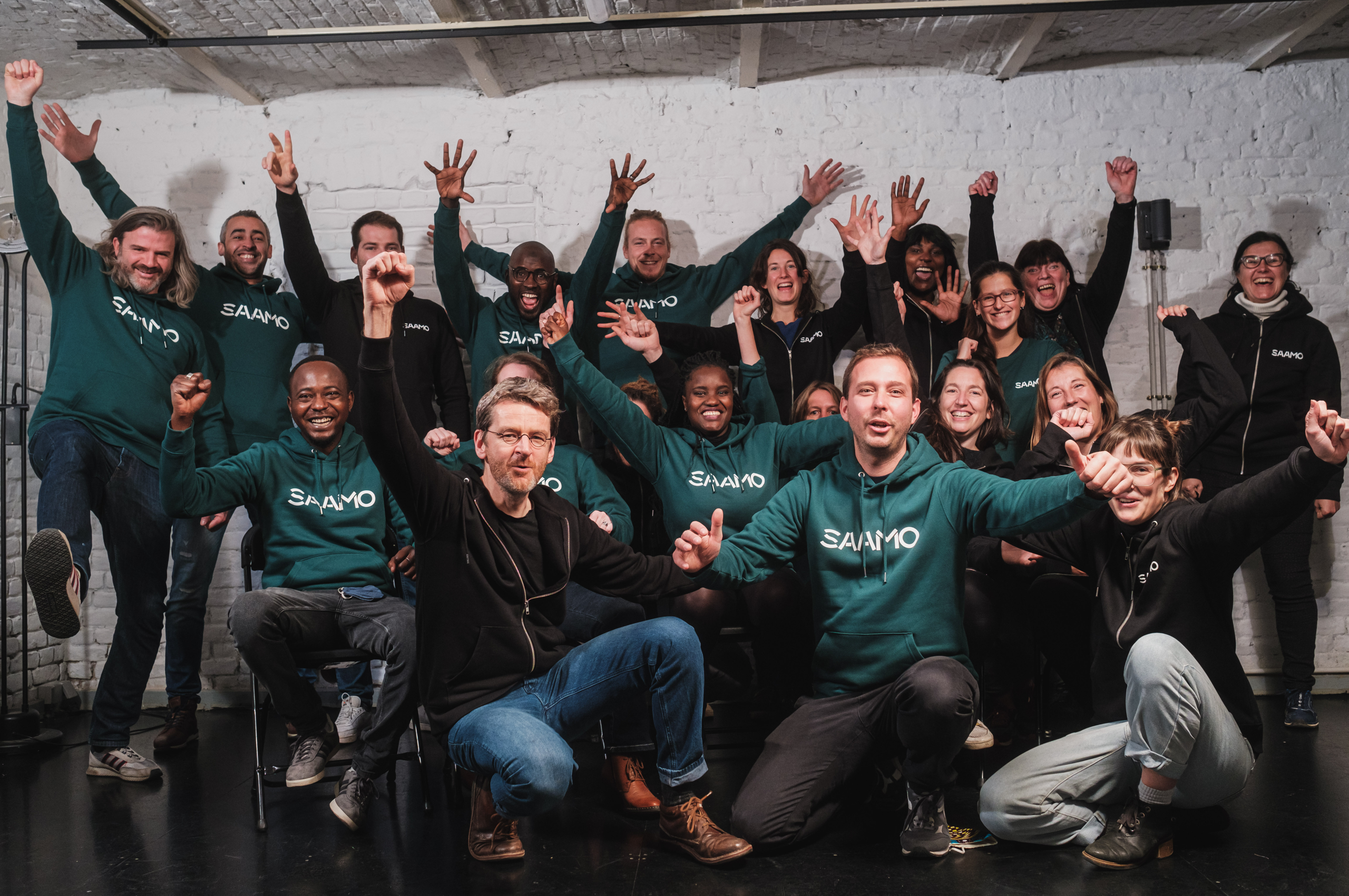
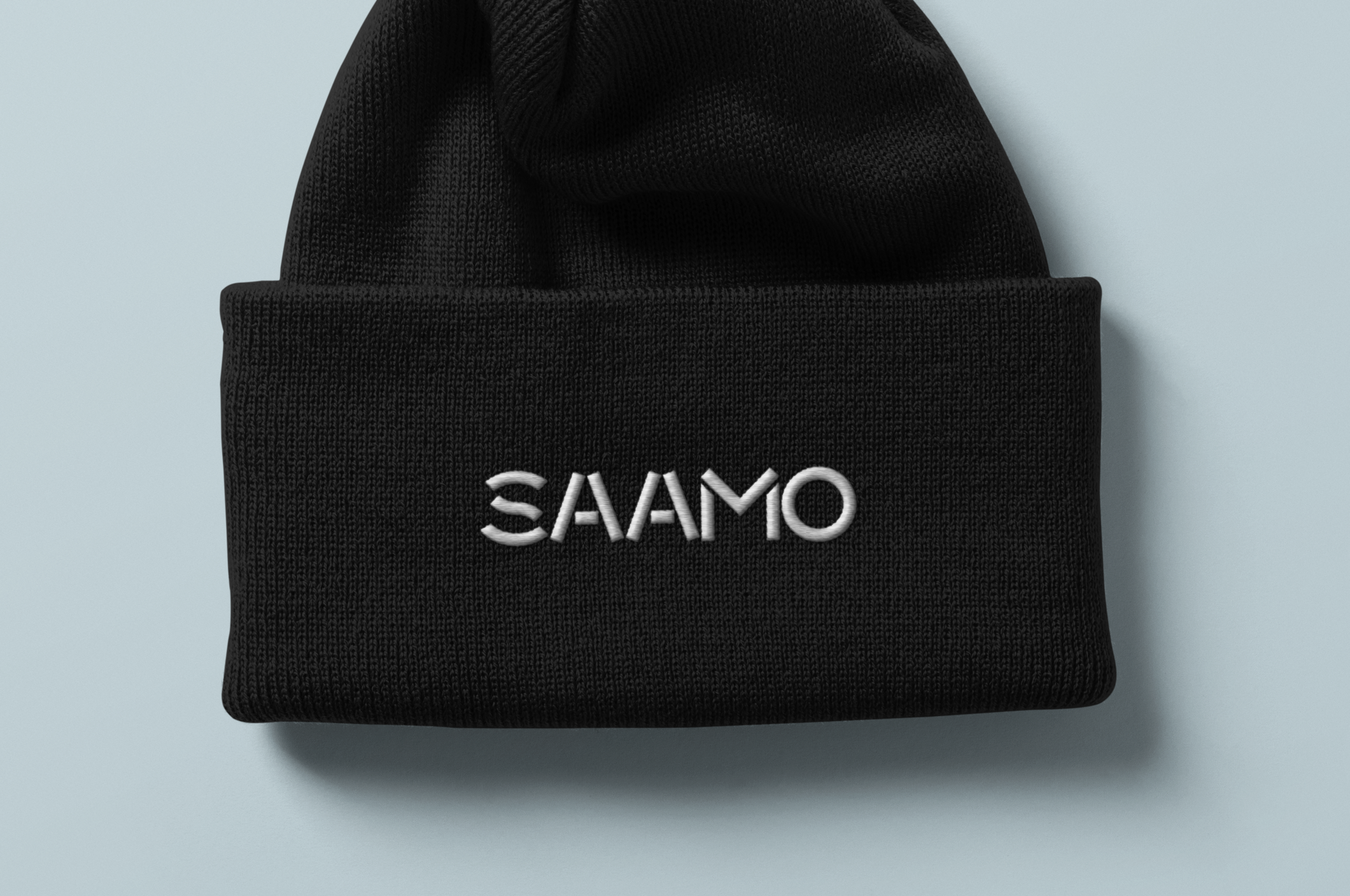
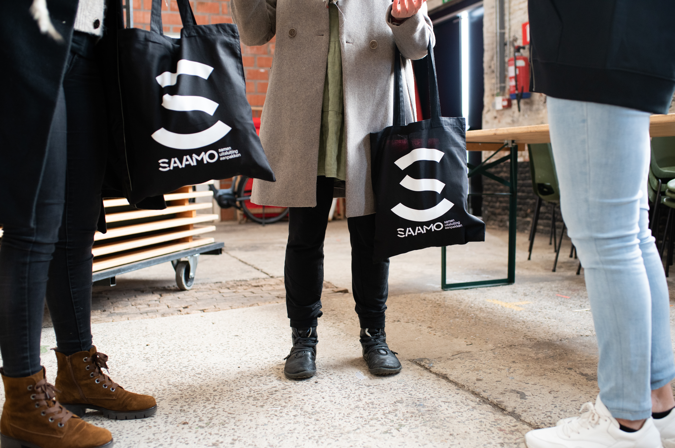
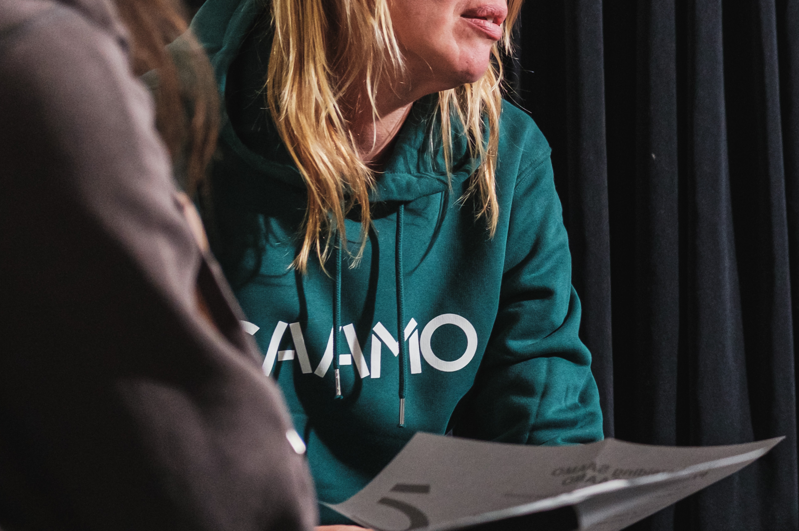
Brand ‘uniforms’
Saamo’s development workers go into their communities every day to make a difference. They wear the brand with love and pride. We made sure that they are easily recognizable by those who need them most, with a collection of stylish items.